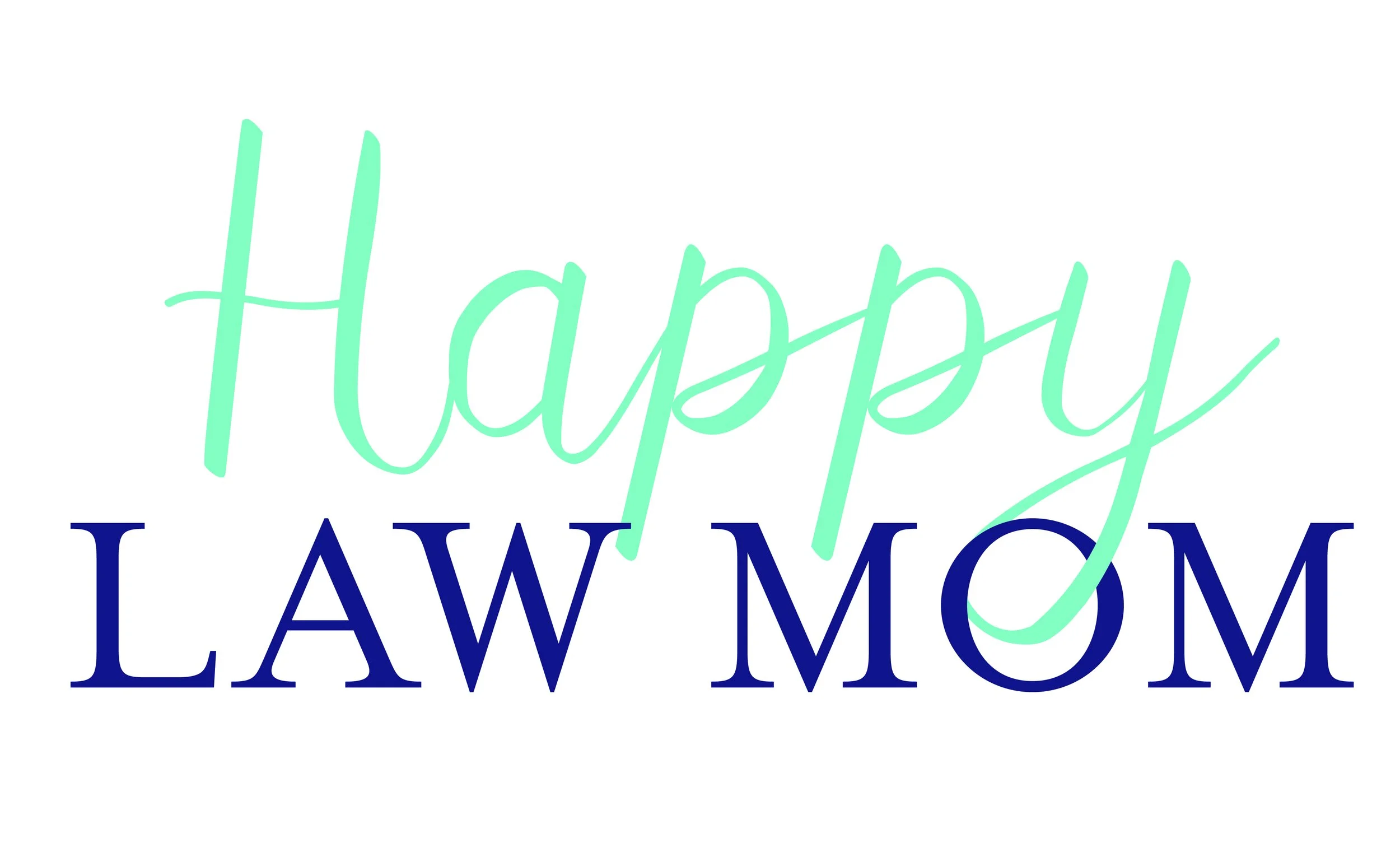
Finding the Joy in Crafting the Brand & Logo for Happy Law Mom
At Studio Red Design, some of our absolute favorite projects are the ones where two seemingly contradictory worlds collide—and our task as designers is to make them dance.
When founder and executive coach Charise Naifeh approached us to build the visual brand and logo for Happy Law Mom, we knew immediately that we were stepping into a uniquely fun creative challenge.
How do you take the precision, authority, and weight of the legal world and infuse it with warmth, energy, balance, and pure joy? You grab your sketchbook and start looking for the magic at the intersection.
The Challenge: Reimagining the Legal Identity
Lawyers are trained to analyze risk, enforce boundary-lines, and operate within rigid, traditional structures. Moms, on the other hand, navigate dynamic, heart-centered, and often chaotic daily landscapes. For many attorney mothers, carrying both roles can feel like living in constant tension—trying to balance demanding careers with thriving family lives.
Charise created Happy Law Mom to break that cycle, offering career coaching and a dedicated podcast that helps lawyer moms reclaim their time, eliminate burnout, and build careers on their own terms.
Her brand needed to look authoritative enough that high-powered attorneys would take notice, but welcoming, vibrant,and approachable enough to feel like a breath of fresh air.
Starting on Paper: Searching for the Spark
As with every project at Studio Red, our design process began off-screen. We started sketching concepts with pencil on paper, exploring how traditional legal symbols—scales of justice, columns, pillar structures, monograms—could be transformed into something fluid, organic, and uplifting.
We wanted to steer clear of dry, corporate clichés. Instead, we focused on geometric balance, clean line work, and friendly curves that communicate clarity, movement, and confidence:
Structure Meets Joy: We paired clean, modern typography that conveys professional weight with welcoming line-art elements that feel human, light, and approachable.
A Vibrant Color Palette: To immediately signal a shift away from traditional law firm blues and grays, we brought in a warm, inviting color suite. The palette balances grounded elegance with bright, energizing pops of color—embodying both executive clarity and vibrant lifestyle wellness.
Versatility Across Platforms: Because Happy Law Mom reaches women across multiple touchpoints—from website resources and assessment tools to podcast cover art and social media tiles—the logo mark was designed to scale effortlessly, looking just as sharp as an app icon as it does at the top of a desktop screen.
For us at Studio Red Design, bringing lightness, personality, and visual clarity to such an important movement was an absolute delight.text.