Your challenges…
our thoughts.
Take a look at our blog where you’ll get a behind the scenes look at the how our design process works. We share examples of our sketches and finished products, as well as some fun stories about us.
Stay connected!

Maret School: Mapping “A Journey of Becoming”
To capture the vibrant spirit of what makes a Maret School student, we started with a stack of pencil sketches (even playing with their frog mascot's lily pads!) before landing on a design that bridges tradition with forward-thinking energy. The final piece layers five custom-built icons—representing pillars like Joyful Learners and Resilient Explorers—over a stunning photographic detail of the campus's iconic front door.
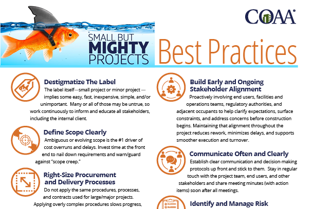
Behind the Design: Building a COAA Infographic
When the Construction Owners Association of America (COAA) needed to pack a massive punch on just a single page, we built a cohesive, custom icon system to act as a visual shorthand. By trading heavy text blocks for clean typography and eye-catching custom symbols, we turned their complex concepts into an instant, high-impact read—delivered in multiple versatile formats so they are ready to roll for print, web, or presentations.
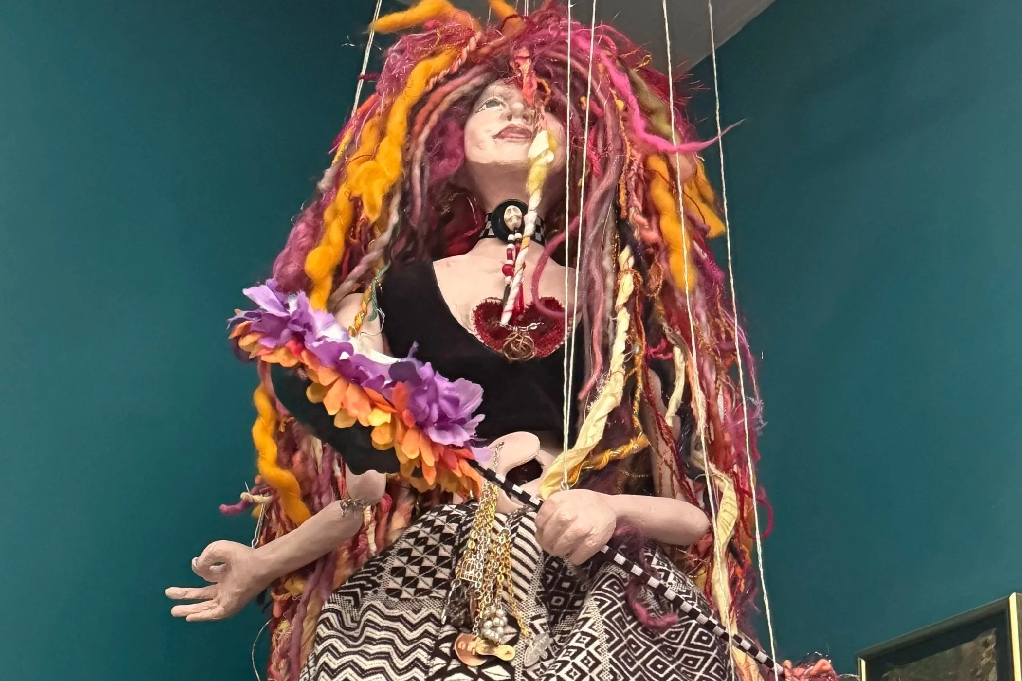
Mini-Me Marionette
So, I was envious of my girls going to college, and decided I would take some classes for myself! They shouldn’t have all the fun….
I sent myself back to school this spring for a deeply humbling jewelry class (verdict: I need stronger readers!) and a wildly fun doll-making class at Montgomery College. With engineering help from teacher Wendy Daniels, crucial yarn and emotional support from Beth Clawson, and custom face-and-ear sculpting from my daughters, I built a mini-me marionette out of paper clay, aluminum foil, and an Ajax bottle—complete with a chain running from my yin/yang gut to my heart to symbolize my girls. [See photos of the final puppet hanging in my living room!]

Designing for Impact: Summer Camp Branding for JTR Jujutsu
When designing for a local institution like JTR Jujutsu, the goal is to capture the essence of the experience in a single glance. For their 2026 Kids Summer Day Camp, we focused on creating a visual language that felt both professional and approachable, ensuring parents and students alike felt the excitement of the upcoming season.
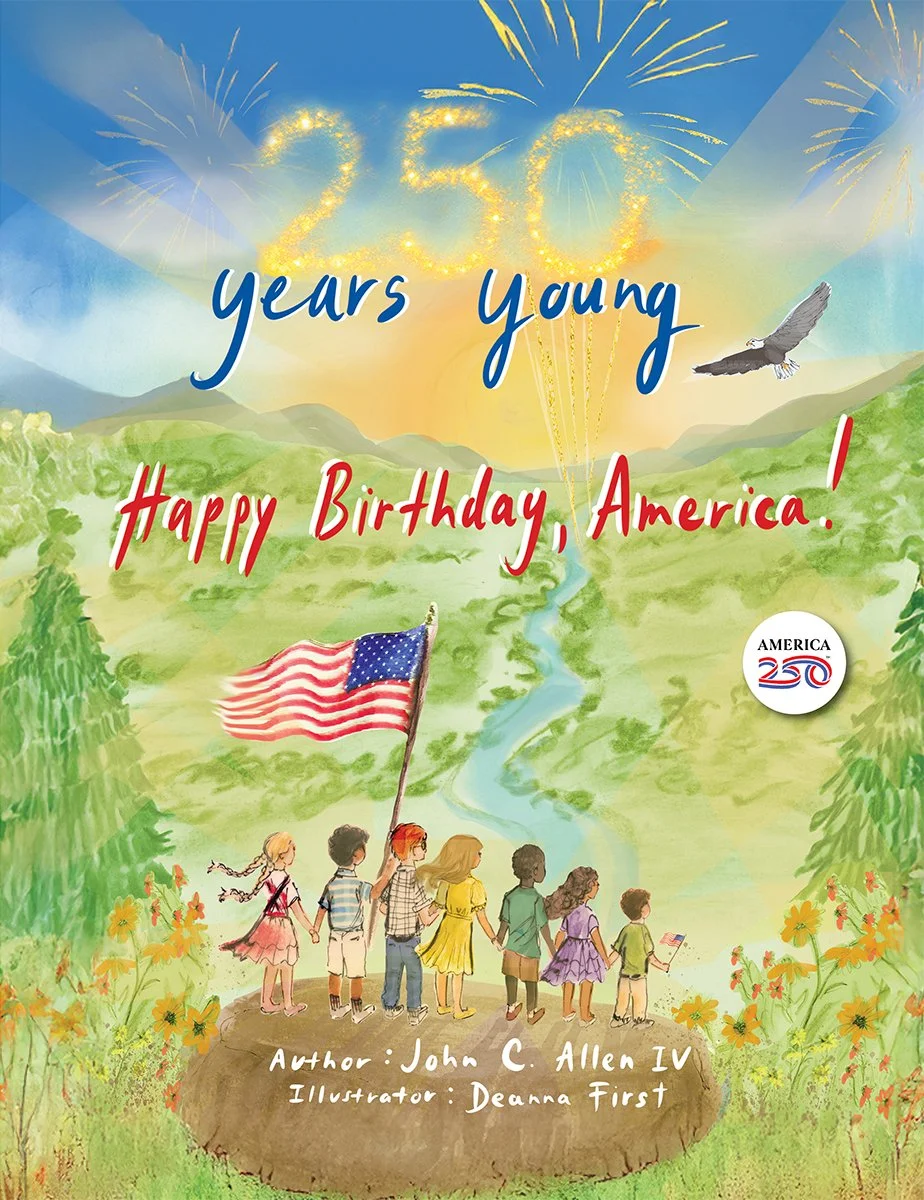
Behind the Scenes: Bringing "250 Years Young" to Life
At Studio Red Design, there is nothing quite like the challenge—and the reward—of transforming a collection of beautiful individual elements into a unified, engaging book. Our recent collaboration on 250 Years Young was a perfect example of this creative journey.
A Creative Reset
Stepping out of the daily D.C. routine and into the quirky, soulful energy of Louisiana was the perfect palette cleanser. I’m heading back to the desk with a fresh perspective, a few ghost stories to tell, and a lot of vibrant New Orleans inspiration ready to channel into my next round of designs.
Cutting-Edge Dies in Print Design
In the world of print design, standing out is key to making a lasting impression. At Studio Red Design, we believe in infusing creativity into every aspect of our work. Incorporating fun dies into your print materials can elevate audience engagement and leave a memorable mark.
Power of Touch
In the realm of print graphic design, the power of touch plays a crucial role in engaging viewers and creating a memorable experience. While digital media dominates much of our interaction with content today, print design offers a unique opportunity to engage the senses beyond the two-dimensional screen.
The Tangible Anchor: Why Print is the Soul of Multi-Channel Communication
In the constant stream of pings, notifications, and "inbox zero" quests, digital communication has a shelf life measured in seconds. For mission-driven organizations, the challenge isn't just reaching an audience—it’s staying with them.
At Studio Red Design, we believe that print is the anchor. It provides a physical weight to your message that pixels simply cannot replicate. When a donor or parent holds a beautifully designed newsletter, they aren’t just reading data; they are experiencing the brand.
The Threshold Effect
A few weeks ago, I had the urge to create some new artwork. For my art, I like to stick to themes that I can carry across multiple projects. The problem that arises from this approach is that it can sometimes inhibit my creativity. Its not about creating a single piece of artwork, but a series. I was browsing through tutorials through YouTube when I happened upon one that intrigued me.
A Weaver…
For years, I have moved through my professional and personal life like the Moon—revealing myself to the world just one phase at a time. To each group, I am a different phase: the Designer, the Yogi, or the Maker. But the truth is, I am a Weaver. I revel in bringing together apparently disparate things into a functional whole. I am excited about my next chapter where I hope to bring all of these phases, or threads, together to show the but the moon in her glorious fullness—inviting everyone into the entire studio of who I am.
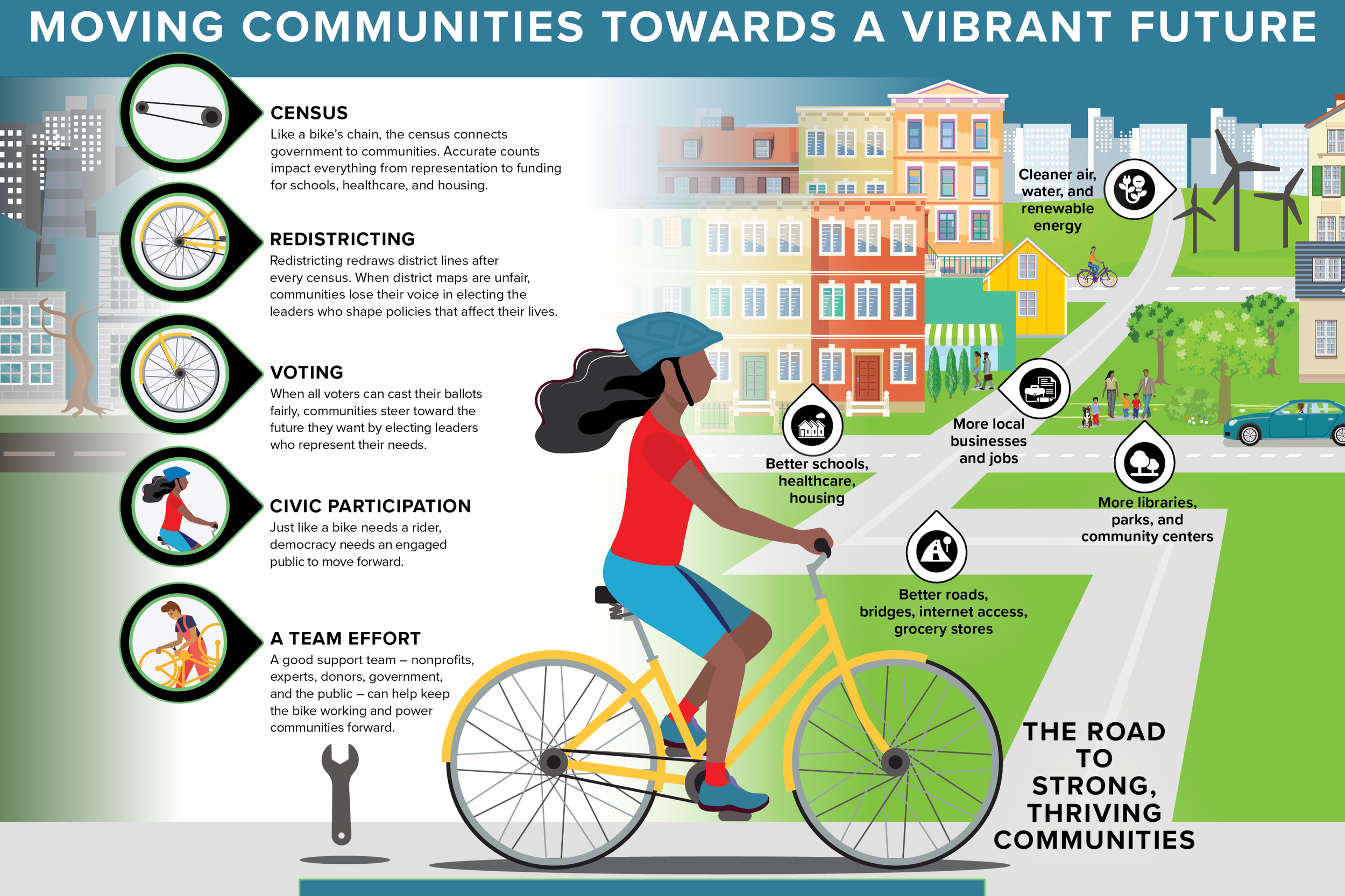
Driving Democracy Forward
In the complex machinery of American democracy, three critical components must work in perfect sync to ensure every voice is heard: an accurate Census, fair Redistricting, and active Voting. At Studio Red, we recently had the privilege of partnering with three powerhouse organizations to help make their ideas into a successful visual.

The Saffron Message: Learning from the Monks who Walked 2,300 Miles for Peace
I feel lucky to be in DC, the destination of the monks long journey for peace, where Venerable Bhikkhu Pannakara spoke at nearby American University’s Bender Arena. Seeing them in their saffron robes was a visual reminder to slow down. Their journey wasn't just about the miles on the road; it was about the journey inward. For me, its a needed reminder to make time to return to my yoga mat, to continue to share my yoga joy and passion when teaching, and continue to find ways to take my yoga (the union of mind, body and spirit) into the world.
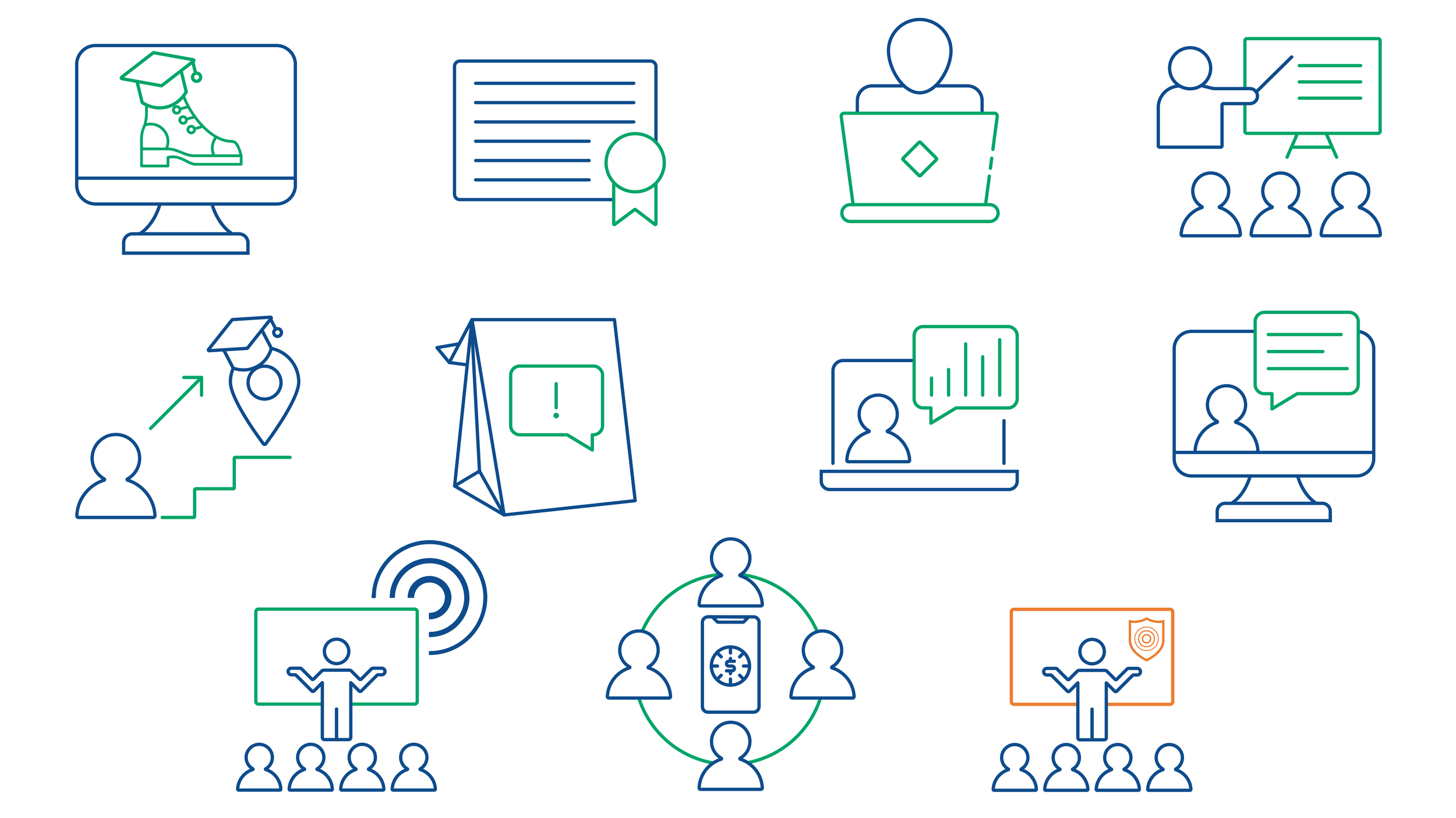
Instant Understanding
They say a picture is worth a thousand words. In the fast-paced world of digital payments, where complex jargon like ACH, RTP®, and Risk Compliance can quickly overwhelm, a well-designed icon is worth even more: it’s worth instant understanding.
We recently had the pleasure of partnering with Wespay to refresh their visual toolkit with a suite of custom line-art icons. The goal? To take their diverse range of member offerings—from education and advocacy to technical payment support—and make them immediately accessible through high-end design.

Print: An Anchor of Credibility
At the recent American Society of Association Executives (ASAE) meeting—the "association for associations"—the directive for 2026 was clear: to thrive in a shifting landscape, organizations must rebuild around digital experiences. But as we move toward a digital-first sponsor strategy, a crucial truth remains: Print is the anchor of credibility.
At Studio Red Design, we help associations navigate this "Media Harmony." It’s not about choosing between digital and print; it’s about using each to build a seamless, high-trust environment for members and sponsors alike. We help associations bridge their aesthetics consistently across their print needs (as conference materials, ads, posters, signage…) to their more daily digital presence.
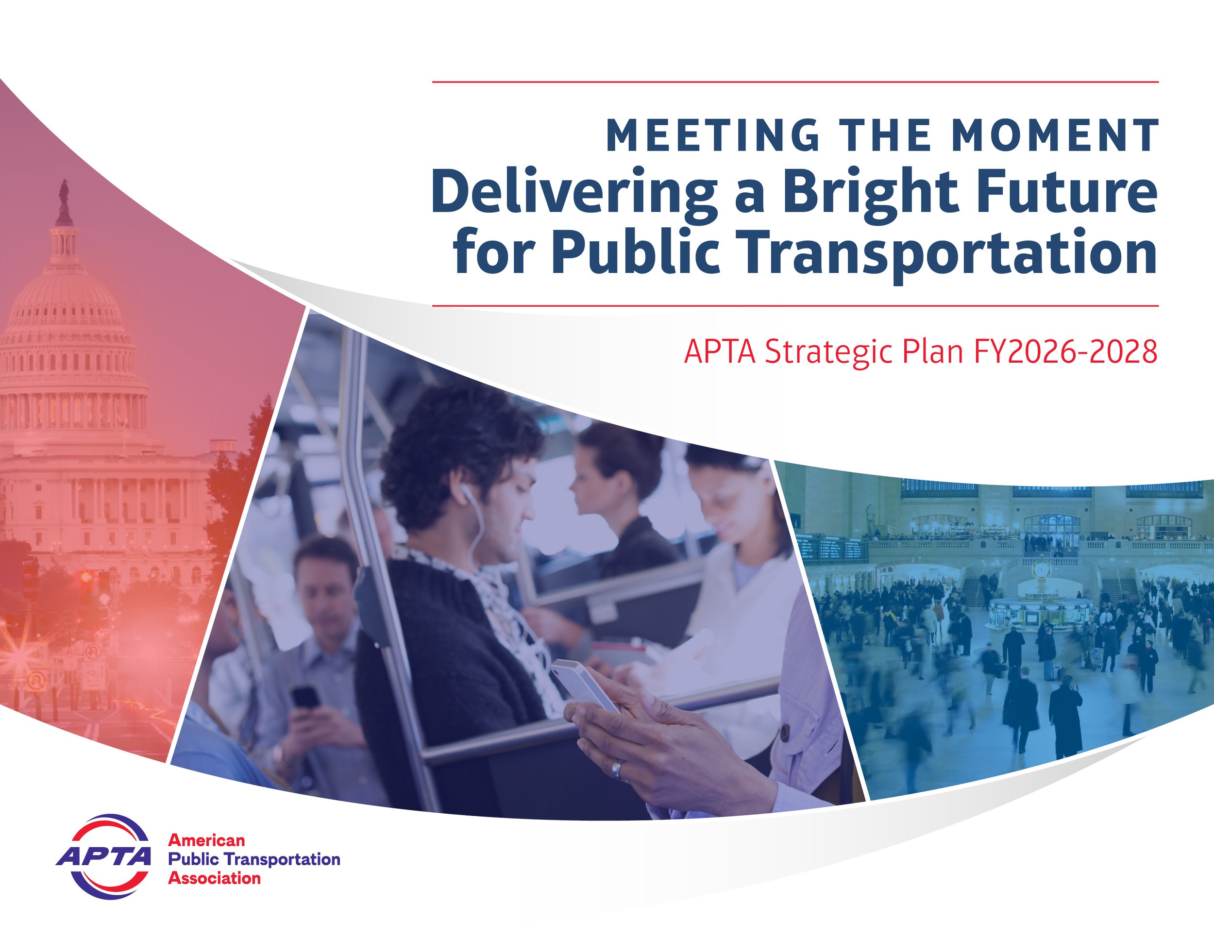
Movement by Design: 18 Years with APTA
When people think of "branding," they often think of a static logo. But for an organization like the American Public Transportation Association (APTA), branding is a constant evolution. Since 2008, Studio Red Design has had the privilege of designing the "look and feel" for APTA’s most significant events, creating a visual narrative that moves as fast as the industry itself.
Celebrating Girls’ Empowerment with Big Hero Images
At Oakcrest, empowering young women is at the core of everything we do. As we embark on the journey of designing a magazine tailored for our vibrant community, we are guided by a vision of celebrating the strength, intelligence, and creativity of each and every girl. One of the key elements we're incorporating into the magazine design is the use of big hero images. These striking visuals serve as powerful statements, capturing the essence of Oakcrest and highlighting the diverse talents and achievements of our students.
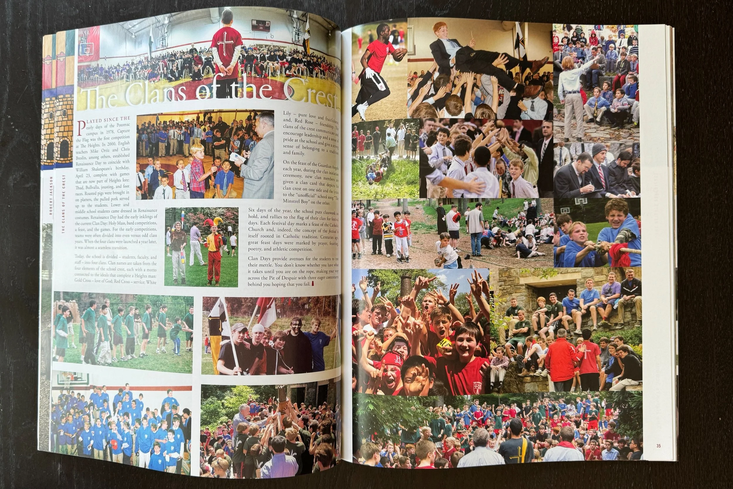
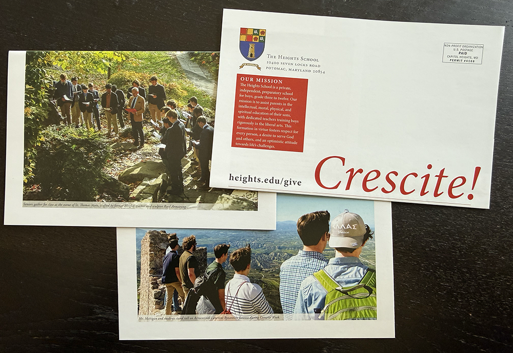
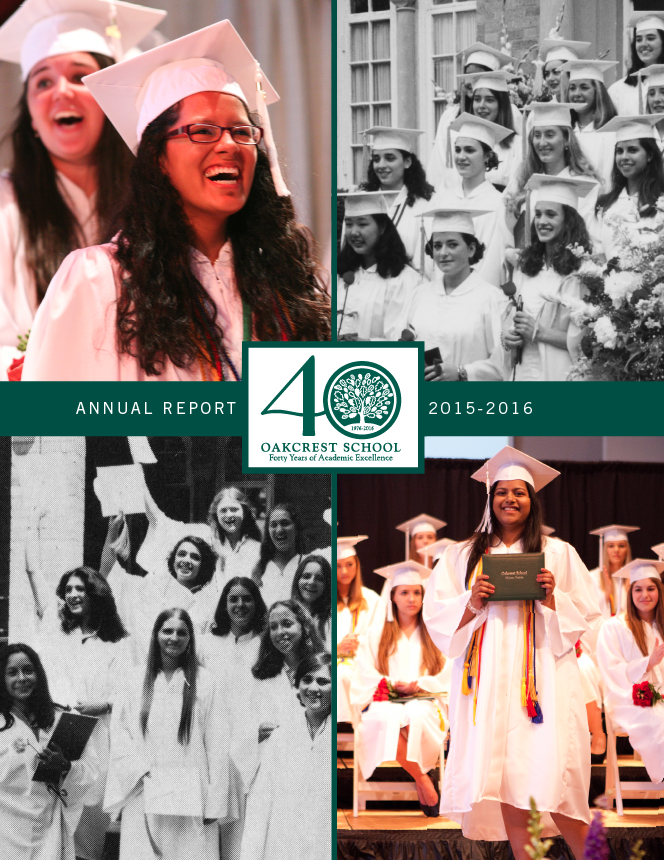
Celebrating Over 20 Years of Magazine Design
The Evolution of The Heights School Publication: We have had the joy of partnering with The Heights School for over two decades of magazine design, reflecting the school's growth, evolution, and unwavering commitment to excellence.
Making the Grade
Your school’s brand isn't just a logo; it’s the way your community feels when they open a magazine, walk through your halls, or receive an invitation.
At Studio Red Design, we specialize in helping educational institutions:
Solidify Consistency: Ensuring your message is clear and your look is unified across all platforms.
Grow Your Brand: Reaching new families while staying true to your founding mission.
Build Community: Creating materials that make alumni, parents, and students proud to belong.
Looking to the future? Let’s talk. Whether you’re planning a capital campaign or looking to refresh your school’s magazine, we’re ready to help you inform, engage, and inspire.
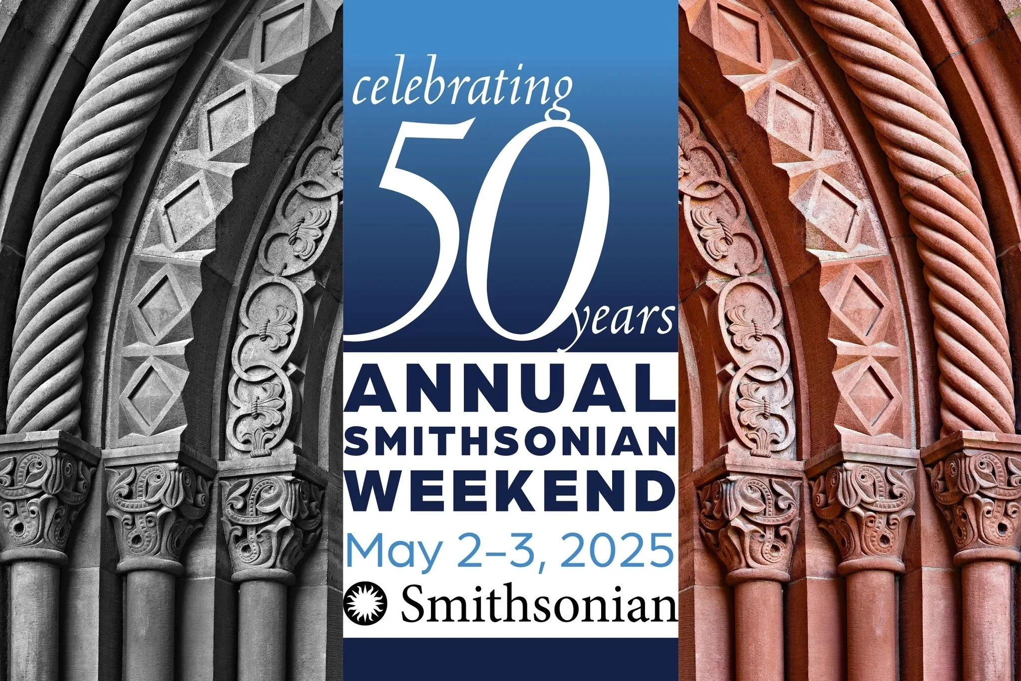
Honoring the Past, Designing the Future
The Vision: A Visual Dialogue
When an institution has 50 years of history to showcase, the design needed to tell a story. Our creative direction for the anniversary logo, invitation, and program centered on a powerful visual juxtaposition: the then and the now.
To bring the 50-year legacy to life, we developed a layout strategy that paired history with modern progress:
The Legacy (Left): On the left side of our spreads, we utilized archival, grayscale photography. these images served as a soulful nod to the Smithsonian’s beginnings and the foundational moments of the last five decades.
The Future (Right): On the right, we paired those historical moments with vibrant, full-color imagery. These contemporary photos showcased the living, breathing impact of the Smithsonian today.