The Tangible Anchor: Why Print is the Soul of Multi-Channel Communication
In the constant stream of pings, notifications, and "inbox zero" quests, digital communication has a shelf life measured in seconds. For mission-driven organizations, the challenge isn't just reaching an audience—it’s staying with them.
At Studio Red Design, we believe that print is the anchor. It provides a physical weight to your message that pixels simply cannot replicate. When a donor or parent holds a beautifully designed newsletter, they aren’t just reading data; they are experiencing the brand.
The Power of the “Touch Point”
Research continues to show that physical media leaves a "deeper footprint" in the brain. Tactile experiences—the texture of the paper, the smell of the ink, the act of turning a page—trigger higher emotional processing. For schools and nonprofits, this translates to increased trust and long-term memory.
Print doesn’t compete with digital; it compliments it. It acts as the "top of the funnel" piece that lives on the coffee table, inviting the reader to dive deeper via a QR code or a website link later that evening.
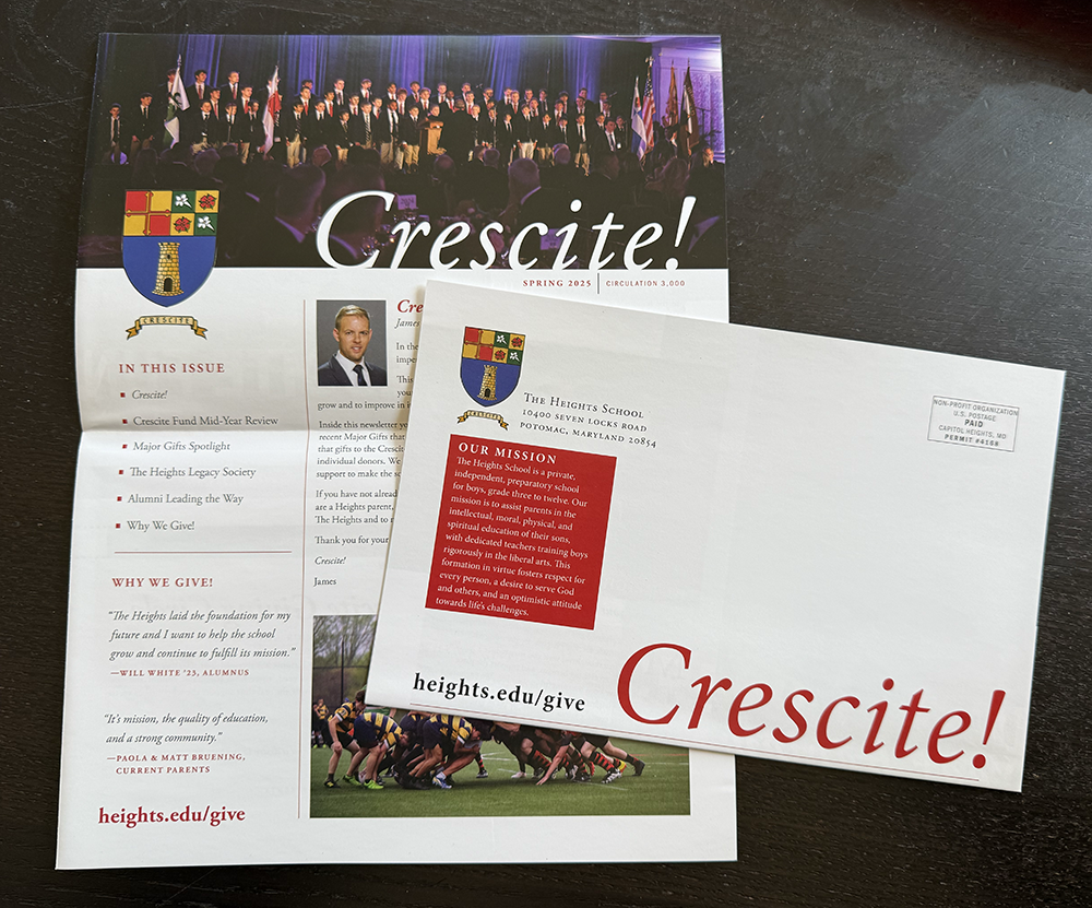
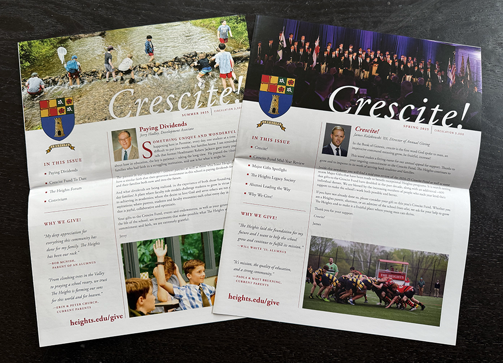
Case Study: The Heights School 4-Page Newsletter
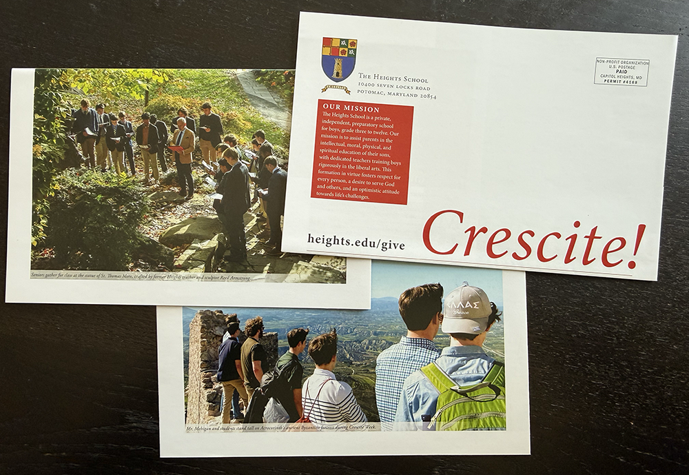
We recently partnered with The Heights School (Potomac, MD) to design a 4-page self-mailing newsletter that serves as a bridge between the school's rich daily life and its community of supporters.
1. The “Why'“ of Giving
The newsletter opens with the core philosophy of The Heights: forming "men fully alive" through a traditional liberal arts education. By highlighting their annual Crescite Fund, the piece explains that tuition only covers a portion of the actual cost of this unique education.
The Goal: To move donors from "supporting a budget" to "investing in a mission."
2. Snapshots of School Life
To make the impact of the Crescite Fund visible, we curated a mix of current photography that captures the full spectrum of the Heights experience:
Lower School: Boys in the "Valley" exploring nature or focused in the classroom.
Middle School: Collaborative projects and the burgeoning "life of the mind."
Upper School: High-level seminars, varsity athletics, and the mentorship that defines the school.
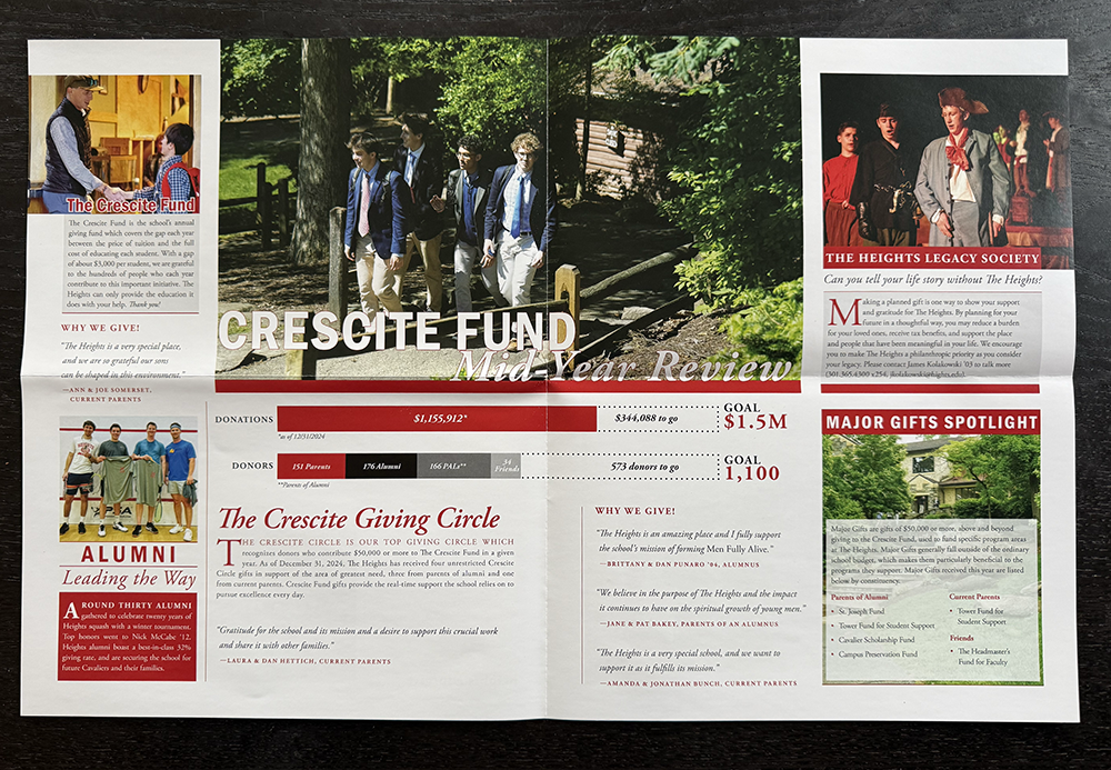
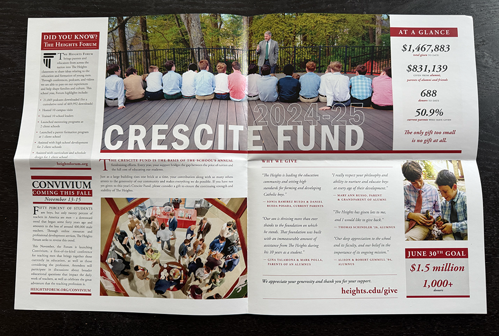
3. Financial Transparency & Growth
The newsletter provides a clear update on the Crescite Fund progress. By showing how funds are used—from hiring top-tier faculty to maintaining the "Old Log Cabin"—donors see exactly where their "stewardship" meets "excellence."
Why This Works for Your Audience
Longevity: An email is deleted; a newsletter is shared.
Focus: Print demands undivided attention. There are no "tabs" to switch to.
Authenticity: High-quality print reflects the quality of the institution.
For schools like The Heights, their mission is about the "intellectual, moral, physical, and spiritual education" of their students. A digital-only approach feels too fleeting for such a profound goal. Print provides the permanence that such a mission deserves.
"At Studio Red, we don’t just design pages; we give your voice form. We make sure your message is heard, understood, and—most importantly—remembered."
Ready to Anchor Your Message?
Does your organization’s digital strategy need a physical companion? Whether it’s an annual report, a capital campaign brochure, or a quarterly newsletter, let’s create something your audience will want to hold onto.