Your challenges…
our thoughts.
Take a look at our blog where you’ll get a behind the scenes look at the how our design process works. We share examples of our sketches and finished products, as well as some fun stories about us.
Stay connected!
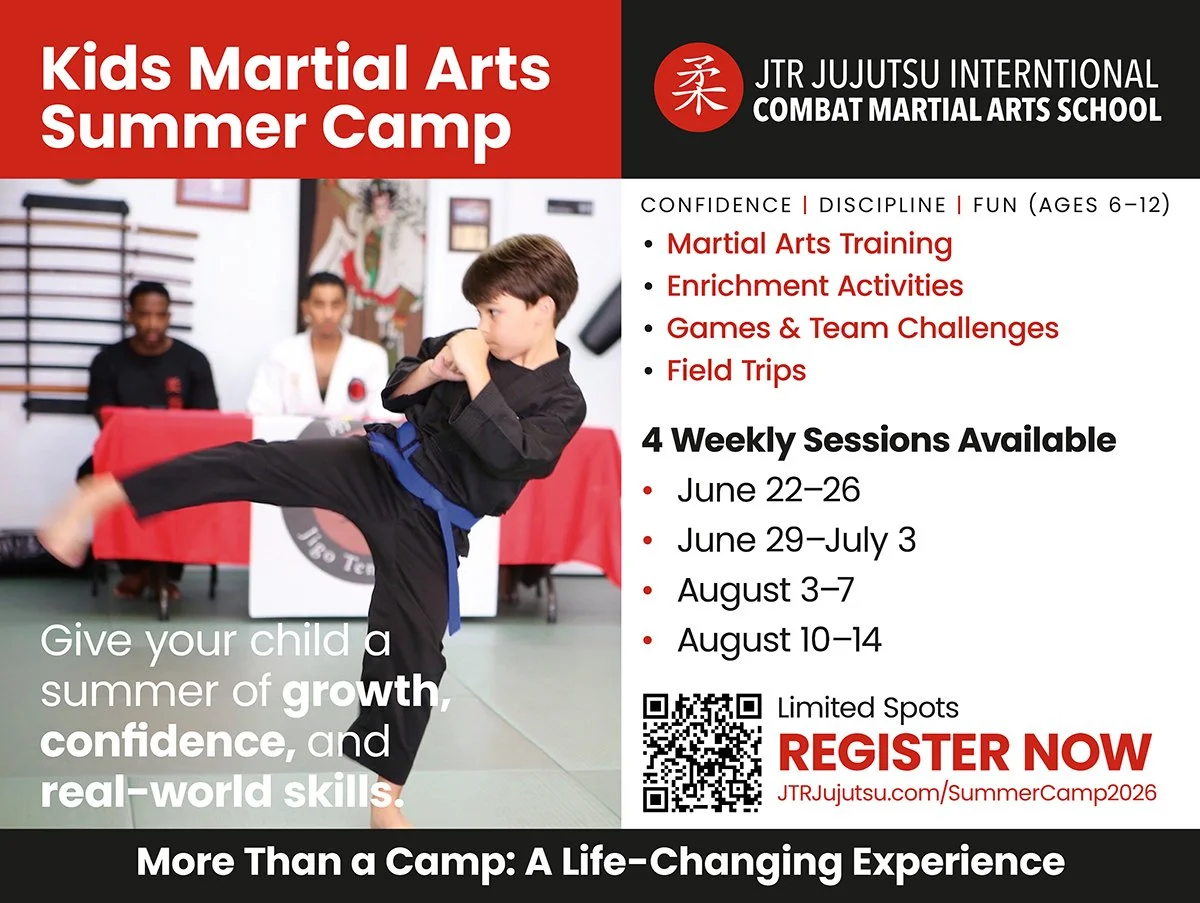
Designing for Impact: Summer Camp Branding for JTR Jujutsu
When designing for a local institution like JTR Jujutsu, the goal is to capture the essence of the experience in a single glance. For their 2026 Kids Summer Day Camp, we focused on creating a visual language that felt both professional and approachable, ensuring parents and students alike felt the excitement of the upcoming season.
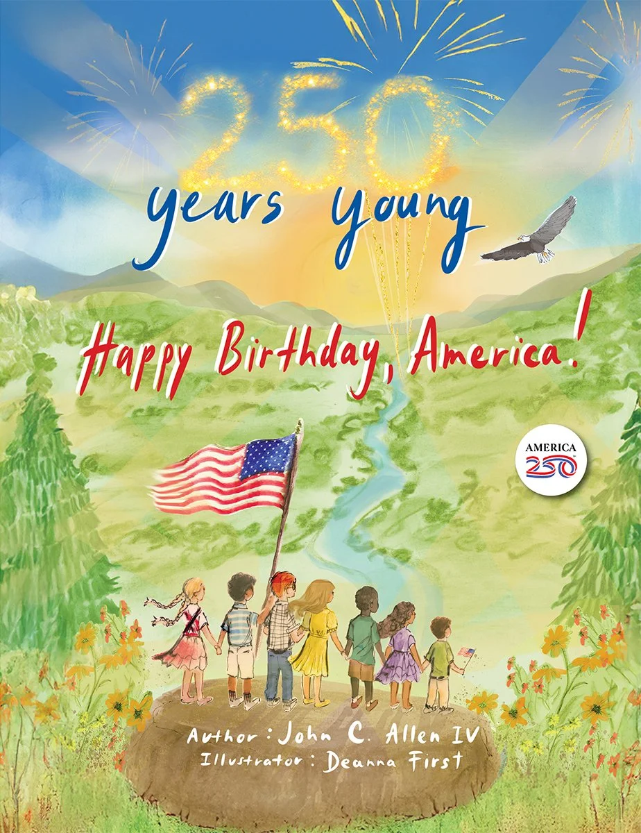
Behind the Scenes: Bringing "250 Years Young" to Life
At Studio Red Design, there is nothing quite like the challenge—and the reward—of transforming a collection of beautiful individual elements into a unified, engaging book. Our recent collaboration on 250 Years Young was a perfect example of this creative journey.
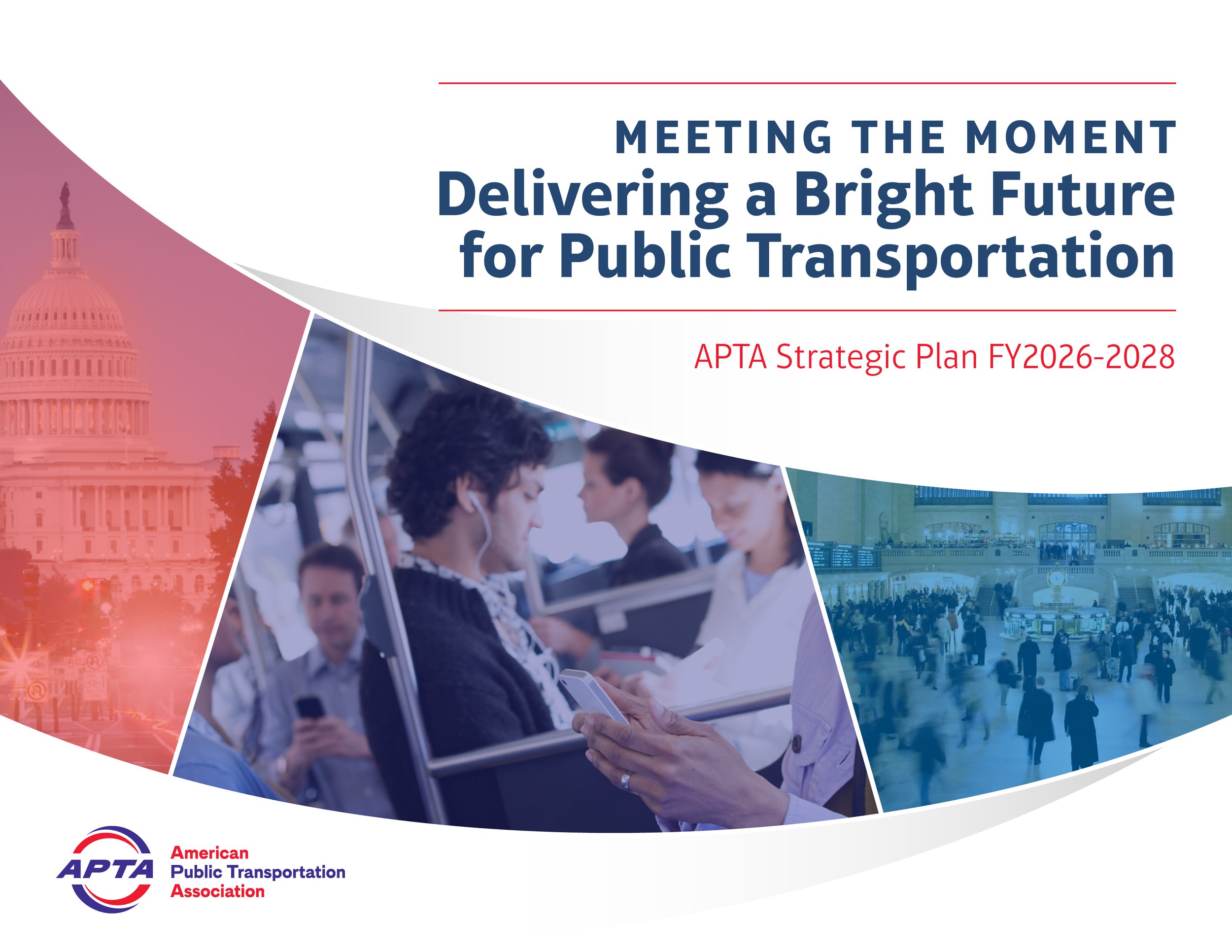
Movement by Design: 18 Years with APTA
When people think of "branding," they often think of a static logo. But for an organization like the American Public Transportation Association (APTA), branding is a constant evolution. Since 2008, Studio Red Design has had the privilege of designing the "look and feel" for APTA’s most significant events, creating a visual narrative that moves as fast as the industry itself.
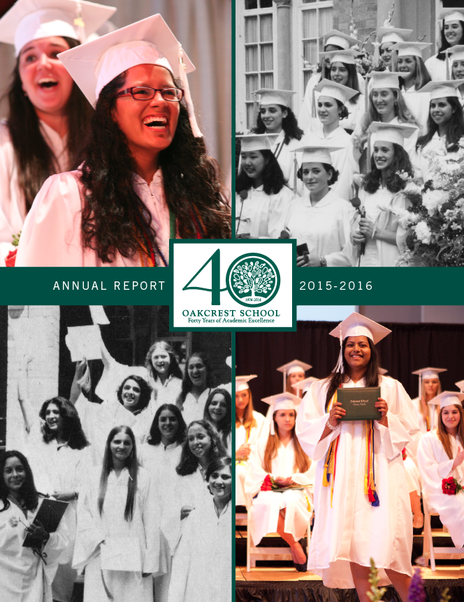
Celebrating Girls’ Empowerment with Big Hero Images
At Oakcrest, empowering young women is at the core of everything we do. As we embark on the journey of designing a magazine tailored for our vibrant community, we are guided by a vision of celebrating the strength, intelligence, and creativity of each and every girl. One of the key elements we're incorporating into the magazine design is the use of big hero images. These striking visuals serve as powerful statements, capturing the essence of Oakcrest and highlighting the diverse talents and achievements of our students.
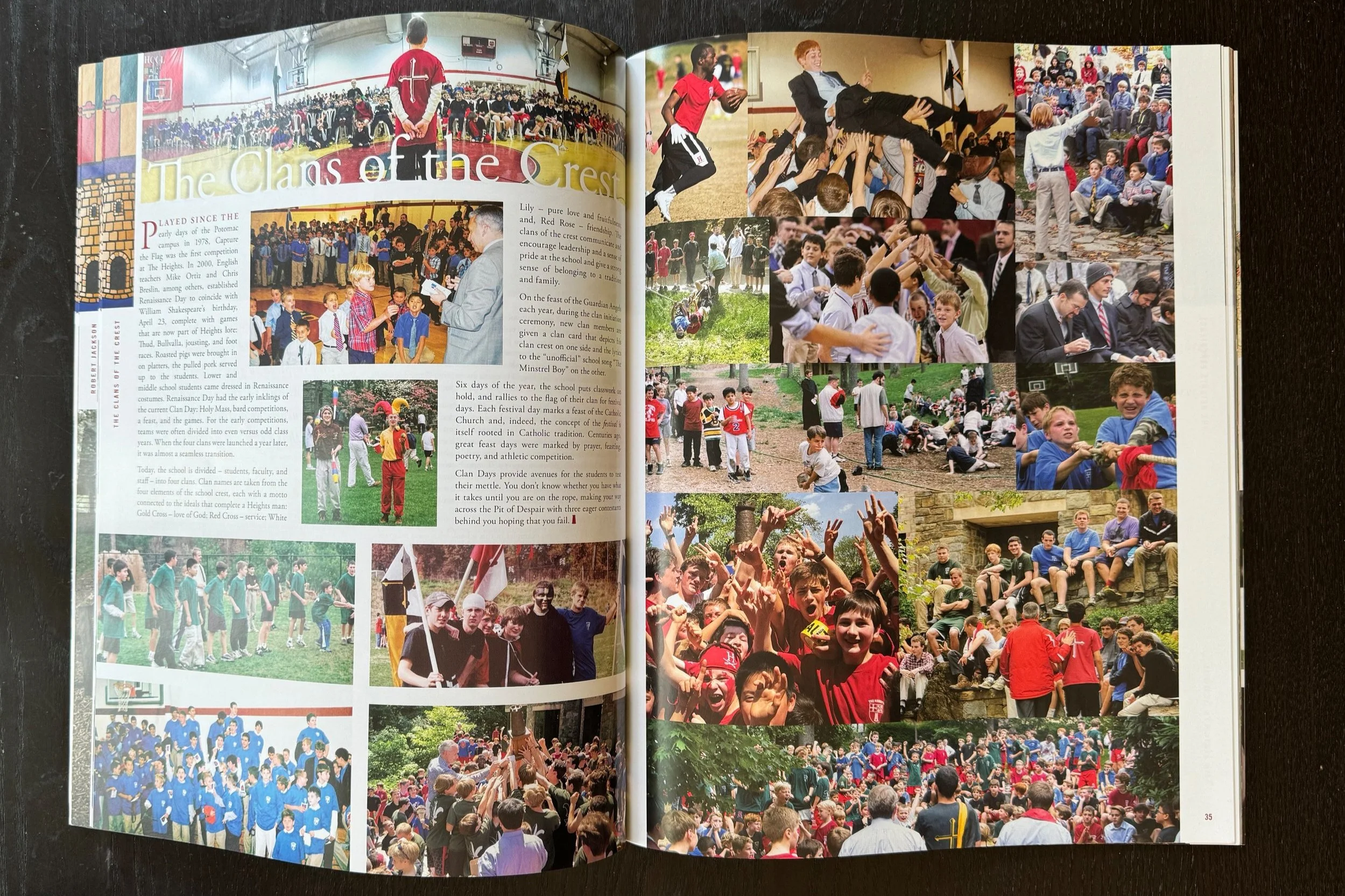
Celebrating Over 20 Years of Magazine Design
The Evolution of The Heights School Publication: We have had the joy of partnering with The Heights School for over two decades of magazine design, reflecting the school's growth, evolution, and unwavering commitment to excellence.
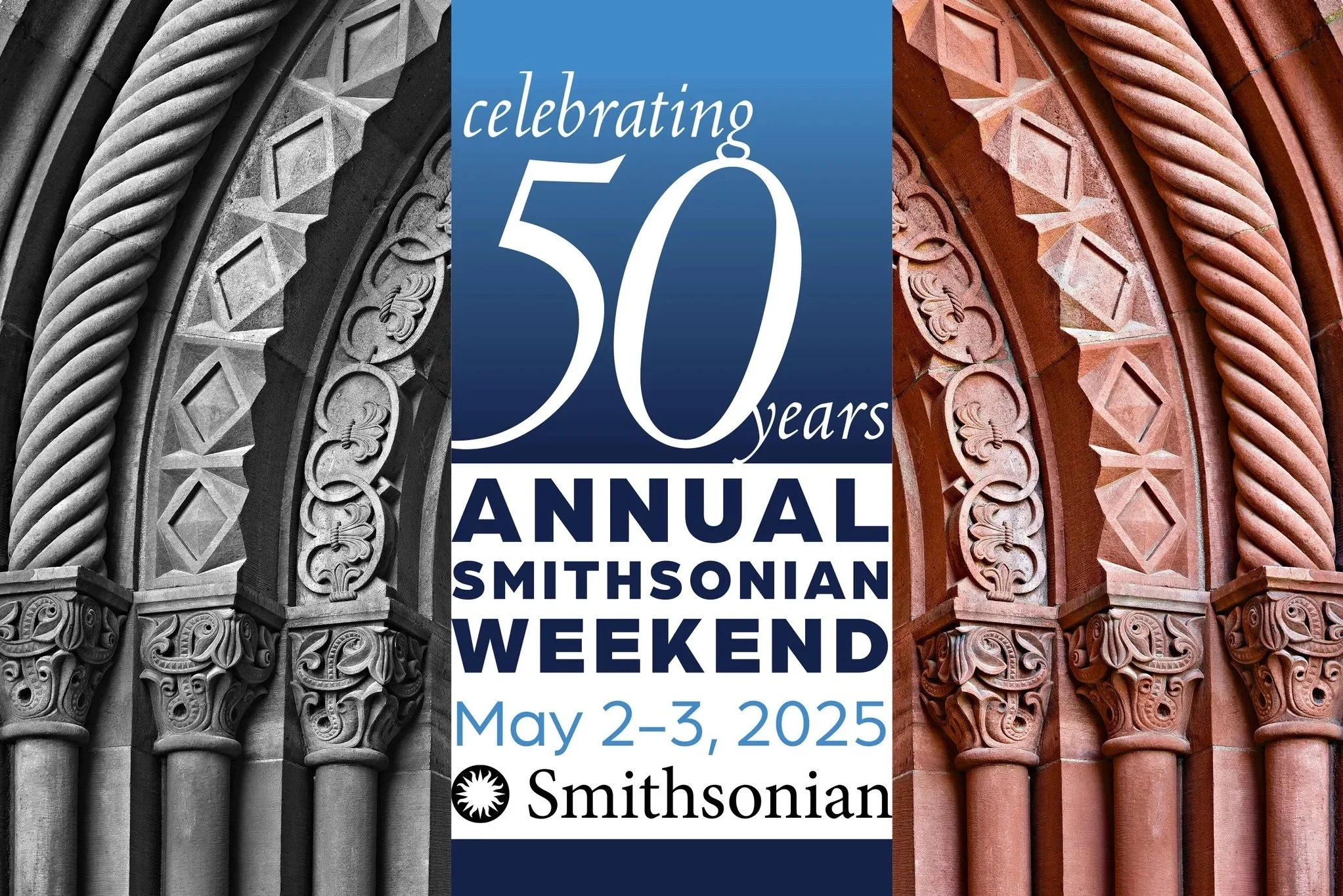
Honoring the Past, Designing the Future
The Vision: A Visual Dialogue
When an institution has 50 years of history to showcase, the design needed to tell a story. Our creative direction for the anniversary logo, invitation, and program centered on a powerful visual juxtaposition: the then and the now.
To bring the 50-year legacy to life, we developed a layout strategy that paired history with modern progress:
The Legacy (Left): On the left side of our spreads, we utilized archival, grayscale photography. these images served as a soulful nod to the Smithsonian’s beginnings and the foundational moments of the last five decades.
The Future (Right): On the right, we paired those historical moments with vibrant, full-color imagery. These contemporary photos showcased the living, breathing impact of the Smithsonian today.

Going Green with OLS
At Studio Red Design, we exist to help mission-driven organizations and institutions—especially those focused on sustainability and environmental care—make their vision a reality. We see our role with OLS as more than just graphic design; it’s about being their creative partner.
Our work is to ensure that OLS’s vital commitment to a circular economy and responsible resource management is communicated clearly, beautifully, and effectively. We have been helping with advertisements, t-shirt designs, sticker promotional materials, and more. We bring a conscientious eye and a creative heart to tell the powerful story of how OLS clients are decreasing both their corporate stress and their environmental footprint.

Driving Change in Style: Why OLS Go Green’s New Buzz is a Masterpiece of Sustainable Design!
Forget a simple logo wrap. The OLS Go Green team went full-throttle on creative messaging, using hundreds of distinct, custom-designed stickers to completely transform the Buzz.
Crucially, there’s a wonderful hippie/flower power undertone to the entire design. This isn't just modern corporate green; it's a nod to the original environmental movement, blending '70s counter-culture aesthetics with 21st-century sustainability goals. You see it in the flowing shapes, the bright, optimistic color palettes, and the overall message of peace, love, and keeping Mother Earth clean. It’s groovy design for a crucial cause!

Collaborative Photography
At Studio Red Design, we’re proud to collaborate with Stacy Swiderski Consulting. Stacy works with photographers on all aspects of their work and brand, from creative coaching and portfolio development to website and project edits, as well as providing personalized marketing support. Through our work together, we create custom print promotions that elevate the work of photographers like Scott Suchman, Rebecca Drobis, Lee Morton, Andrea Joseph, Andy Ryan, the Rathkopfs, and more. As Stacy says, “Brands are belief systems.” Through high-quality direct mail pieces—brochures, postcards, and booklets—we leverage the tactile power of print to leave a lasting impression that digital just can't match.

Health Unscripted
Health Unscripted: a 24-page plus cover saddle stitch brochure mixes glama natural (a semi-transparent sheet that is reminiscent of skin) for bold text with a coated silk sheet for striking photographs. This piece engages the senses (especially those of touch and sight) and captivates the viewer as the glama partially reveals and conceals with moving captions and lyrical text placement to activate the deeply poignant images by photographers as well as survivor and caregiver duo, Anna and Jordan Rathkopf.
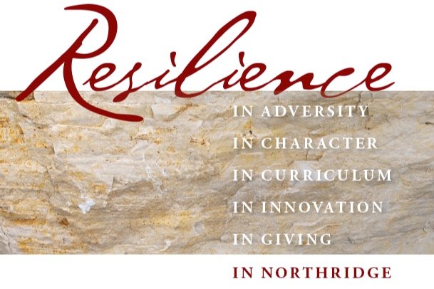
Elevating Northridge Preparatory School’s Brand
We're delighted to share the productions of our partnership with Northridge Preparatory School, an all-boys school nestled just outside of Chicago. Over the course of several years, Studio Red Design had the privilege of collaborating with the school, playing a pivotal role in shaping and refining their print materials.
Our journey with Northridge involved more than just design; it was about formalizing their brand identity and ushering in a transformative evolution of their visual aesthetics. From conceptualization to execution, we worked hand-in-hand to ensure their print materials not only reflected their values but also stood out with a unique and polished appeal.
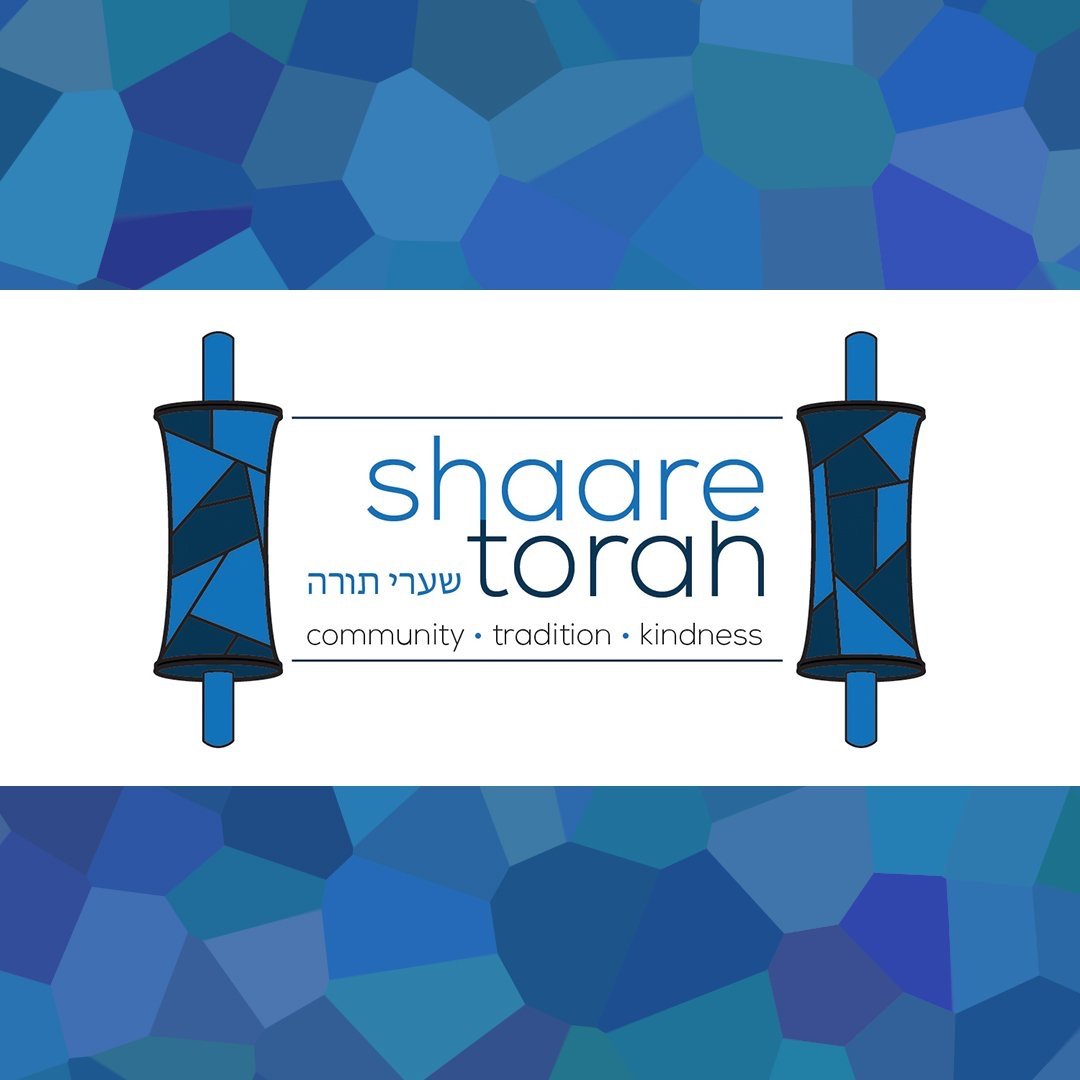
Logo for Shaare Torah
We were lucky to have the opportunity to partner with this synagogue: Shaare Torah is a vibrant, open-hearted, joyful and multi-generational synagogue community where you are welcome as you are. They learn, pray, play, pursue justice and find inspiration as thrive to grow Jewishly together. Here is a glimpse at our logo process.
Clients We Love: River School
We are excited to share with you the most recent edition of River School’s yearly impact report. This amazing school’s mission is to challenge each child to work collaboratively, to think critically, and to develop the confidence to take risks, embrace their curiosity, and find their voice.

Stone Ridge School of the Sacred Heart: Celebrating 100 years
We are excited to share with you the most recent edition of Stone Ridge School of the Sacred Heart’s magazine. This amazing school mission is to inspire young women to lead and serve, through lives of purpose that integrate faith, intellect, community, social action, and personal growth in an atmosphere of wise freedom.

Unbroken Traditions
We continue to be honored to partner with the International Campaign for Tibet (ICT) to help them create their 2024 calendar. This calendar focuses on the Tibetan cultures that endure in exile. ICT is the largest support group in the world working to support Tibet by acts of skillful compassion. From climate change to the survival of democracy, Tibet is at the heart of the biggest challenges facing the world.

Clients We Love: APTA
Every year, Studio Red Designs partners with the American Public Transportation Association to help them create a wide range of graphics, both print and digital.
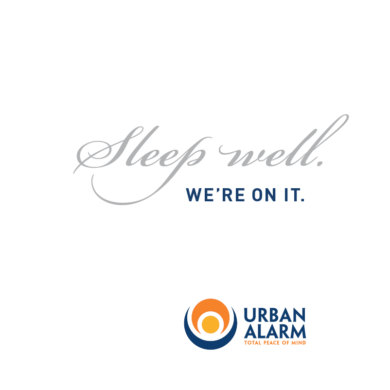
Urban Alarm
Excited to share with you this lovely, personable square mini booklet. Gorgeous printing with soft touch laminate cover with spot gloss varnish to accentuate typography, white gloved hand and logo. We partnered with the writing gurus at Jansen Communications to bring the safety and care of this personalized home security service to life.

Clients We Love: World Resources Institute
Studio Red Design (Red) is a full-service graphic design firm with decades of experience across our team of serving organizations like yours/WRI. In fact, we have specific experience partnering with WRI on important projects such as Tomorrow’s Markets, WRR 2008/2011, GHG Protocols and more recently State of Climate Action Reports for 2021 & 2022. We bring unique insights into your organization and how you work to help you achieve and advance your mission and objectives.

The Future of Farming… Is Female
Studio Red Design recently collaborated with Rebecca Drobis and Philly Reps on a promotional self-mailer. The goal of the mailer was to promote Rebecca’s gorgeous photographs of female farmers, while providing a memorable and unique opening experience that would stay with the recipient. We settled on a modified iron-cross fold that would aid in effectively providing pride of place for the striking images while keeping the enclosed over-sized seed packet nestled safely in the center.
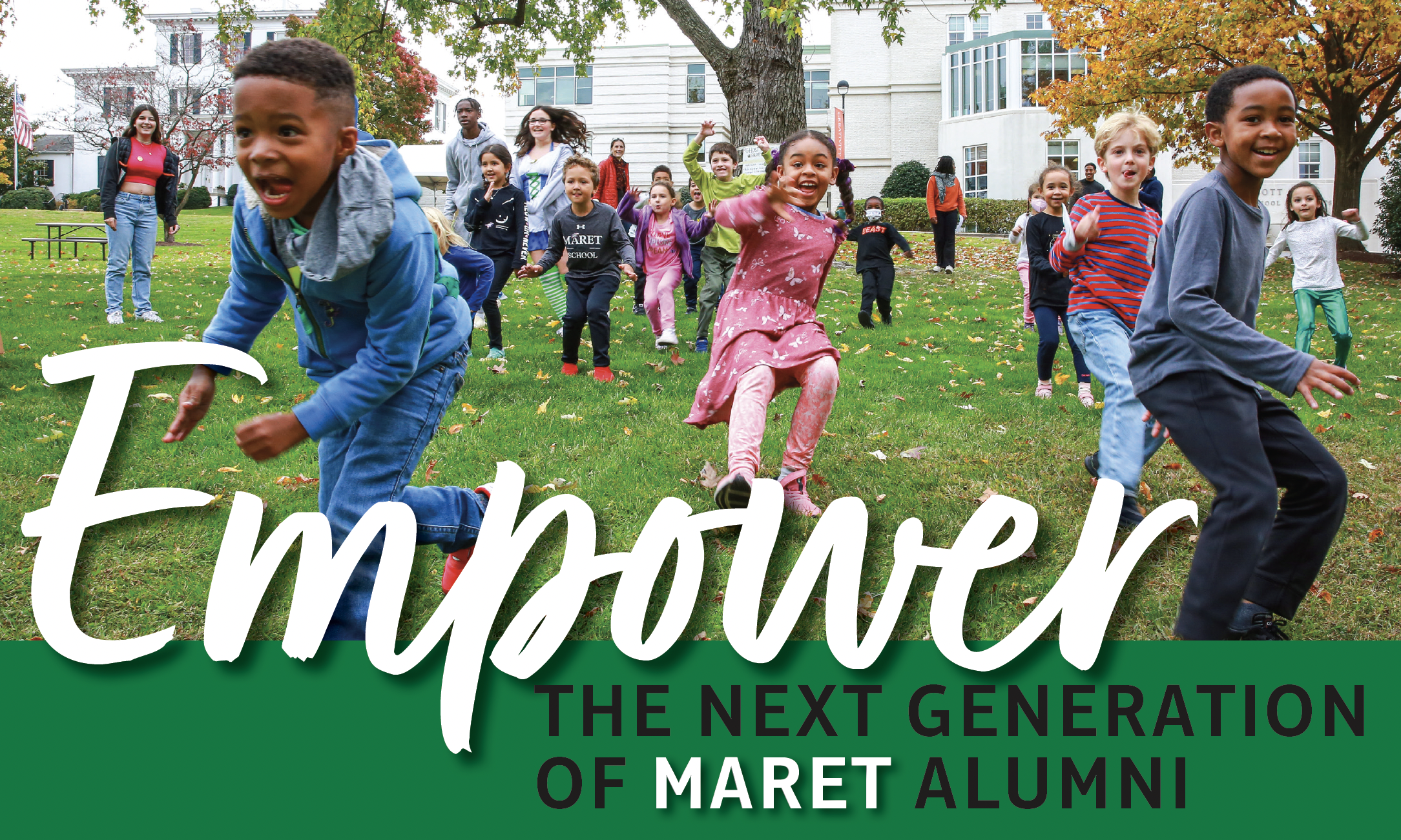
Clients We Love: Maret School
We recently had the pleasure of partnering with Maret School to design their Capital Campaign printed materials. These included logo development, letterhead, a presentation deck and booklet mailed to friends and families of the school. Following the branding of their Capital Campaign logo, we used the circle as a design element throughout the campaign pieces. A special die cut was created for the booklet cover to highlight the mosaic detail.