Movement by Design: 18 Years with APTA
When people think of "branding," they often think of a static logo. But for an organization like the American Public Transportation Association (APTA), branding is a constant evolution. Since 2008, Studio Red Design has had the privilege of designing the "look and feel" for APTA’s most significant events, creating a visual narrative that moves as fast as the industry itself.
The Challenge: New Year, New Audience, New Look
The central hurdle of any annual conference is the paradox of familiarity versus novelty. How do you design a look that signals "something new is happening" while ensuring the thousands of attendees immediately recognize it as an APTA event?
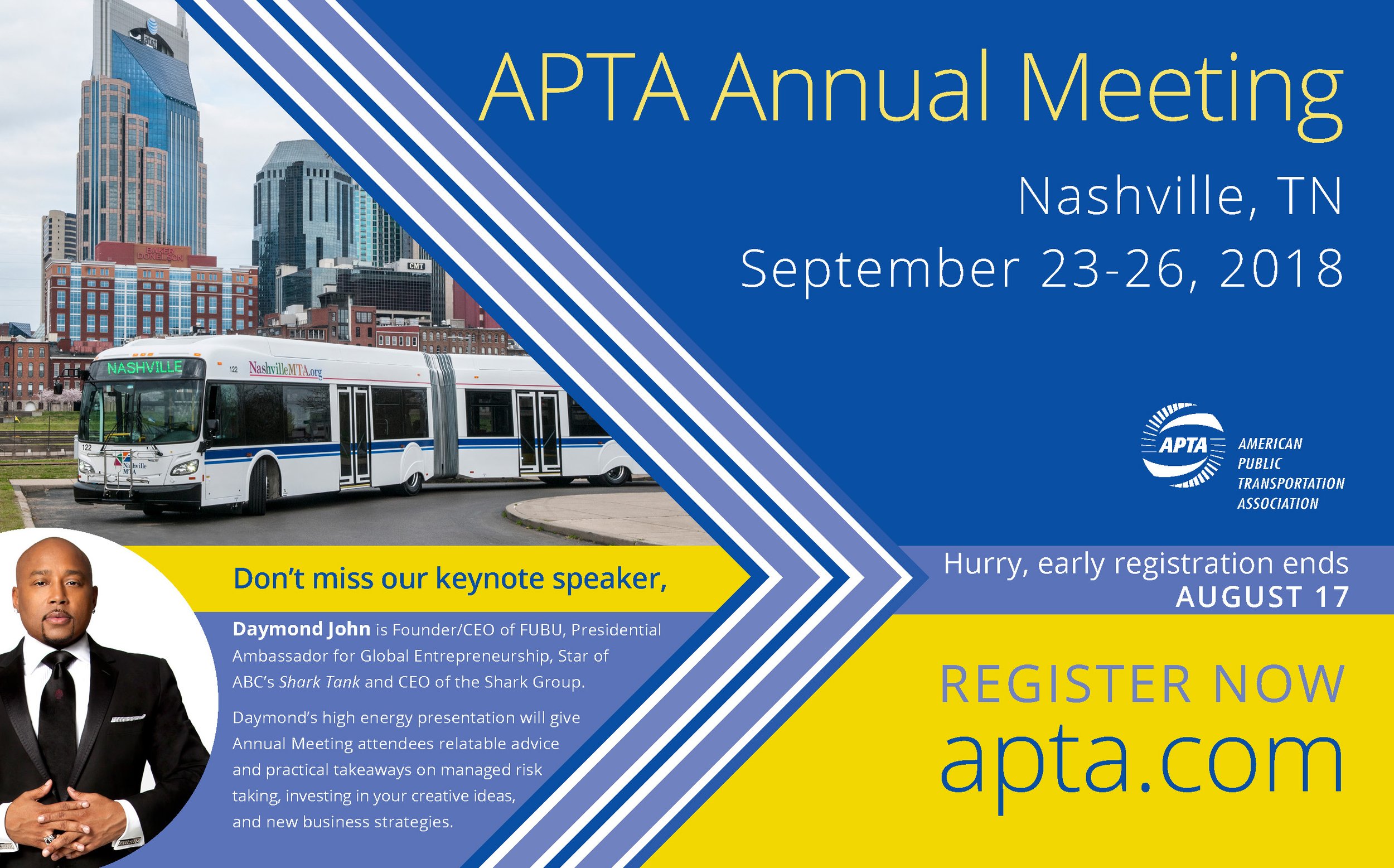
Over the years, we’ve transitioned from the archival photography of the early 2000s to the high-energy, pattern-driven aesthetics of today. Each year requires a bespoke visual language that translates across different target audiences—from urban planners and transit engineers to tech innovators and policy makers.
The Hierarchy of Color
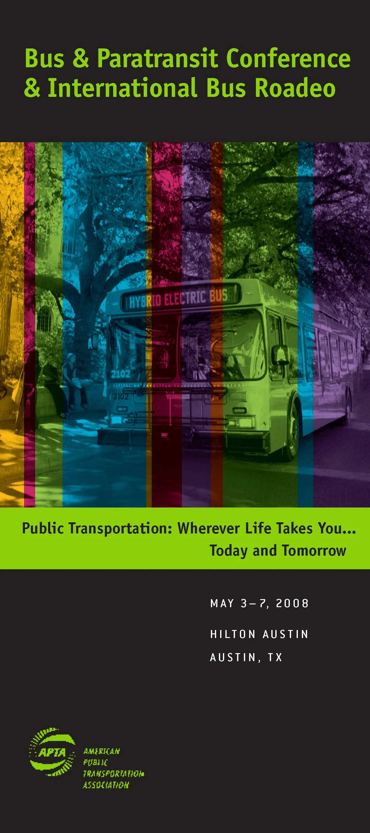
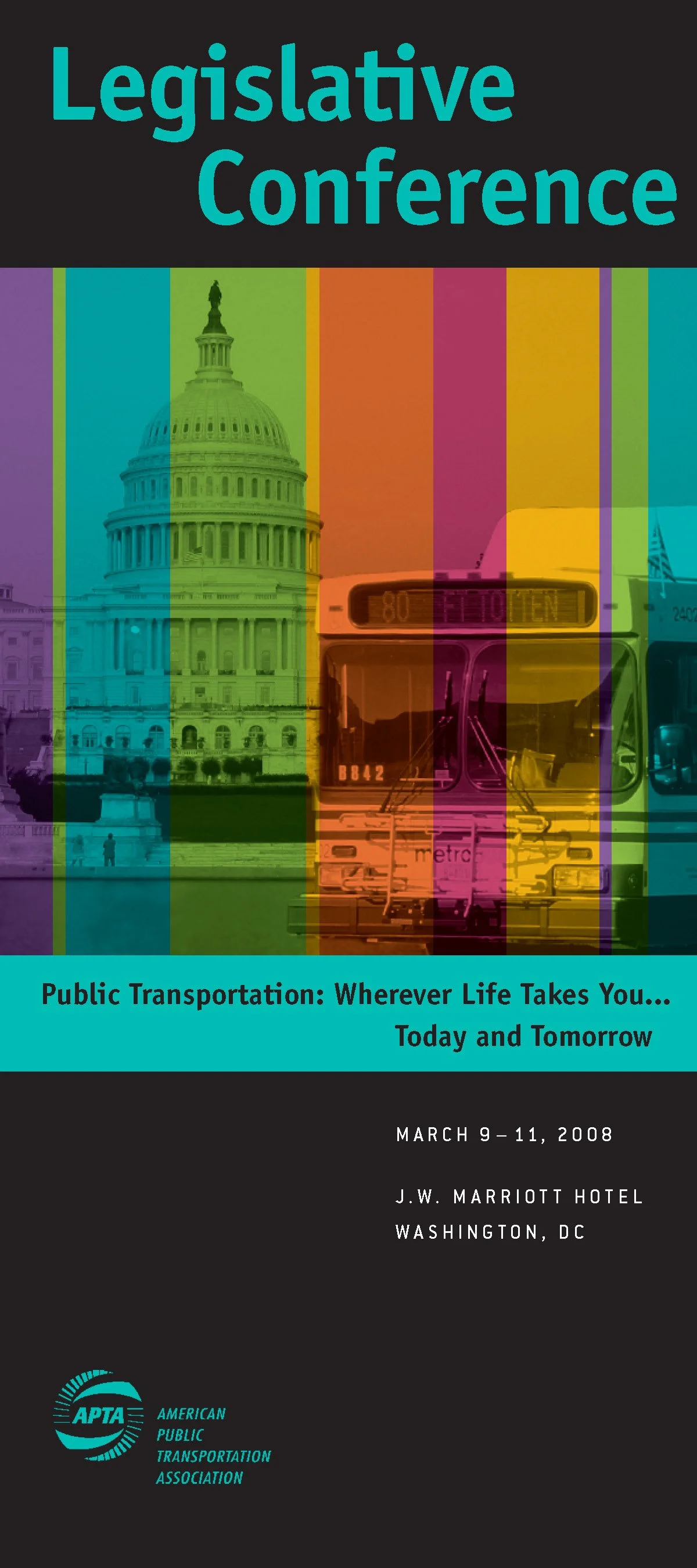
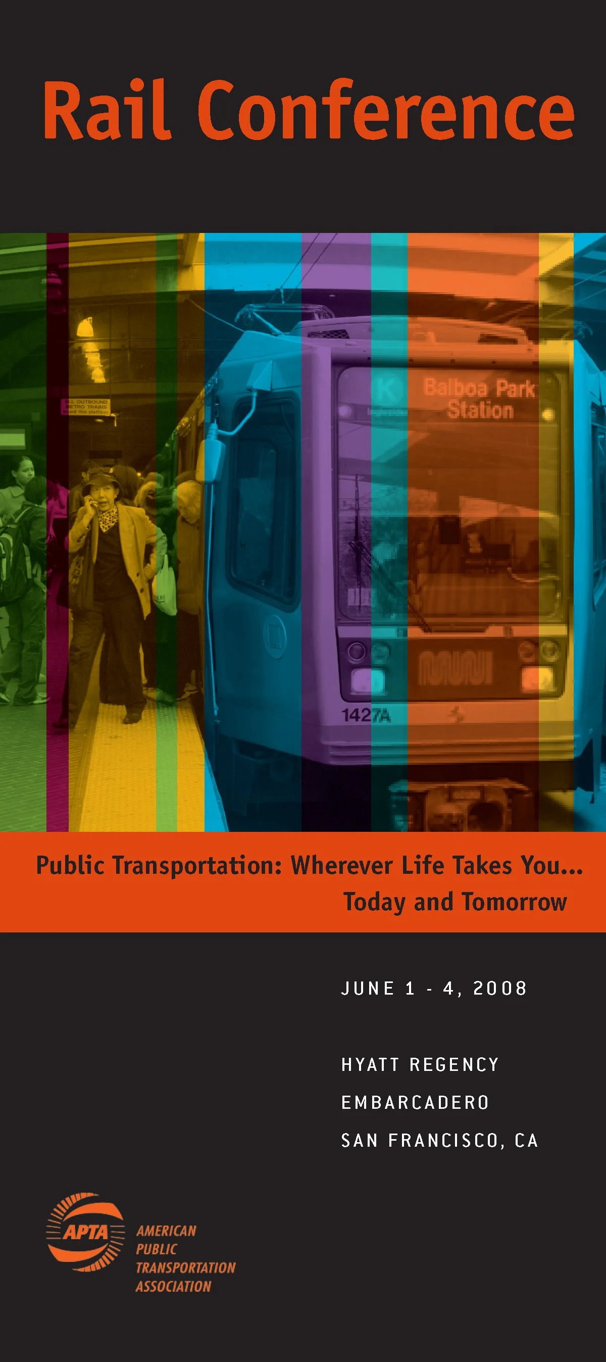
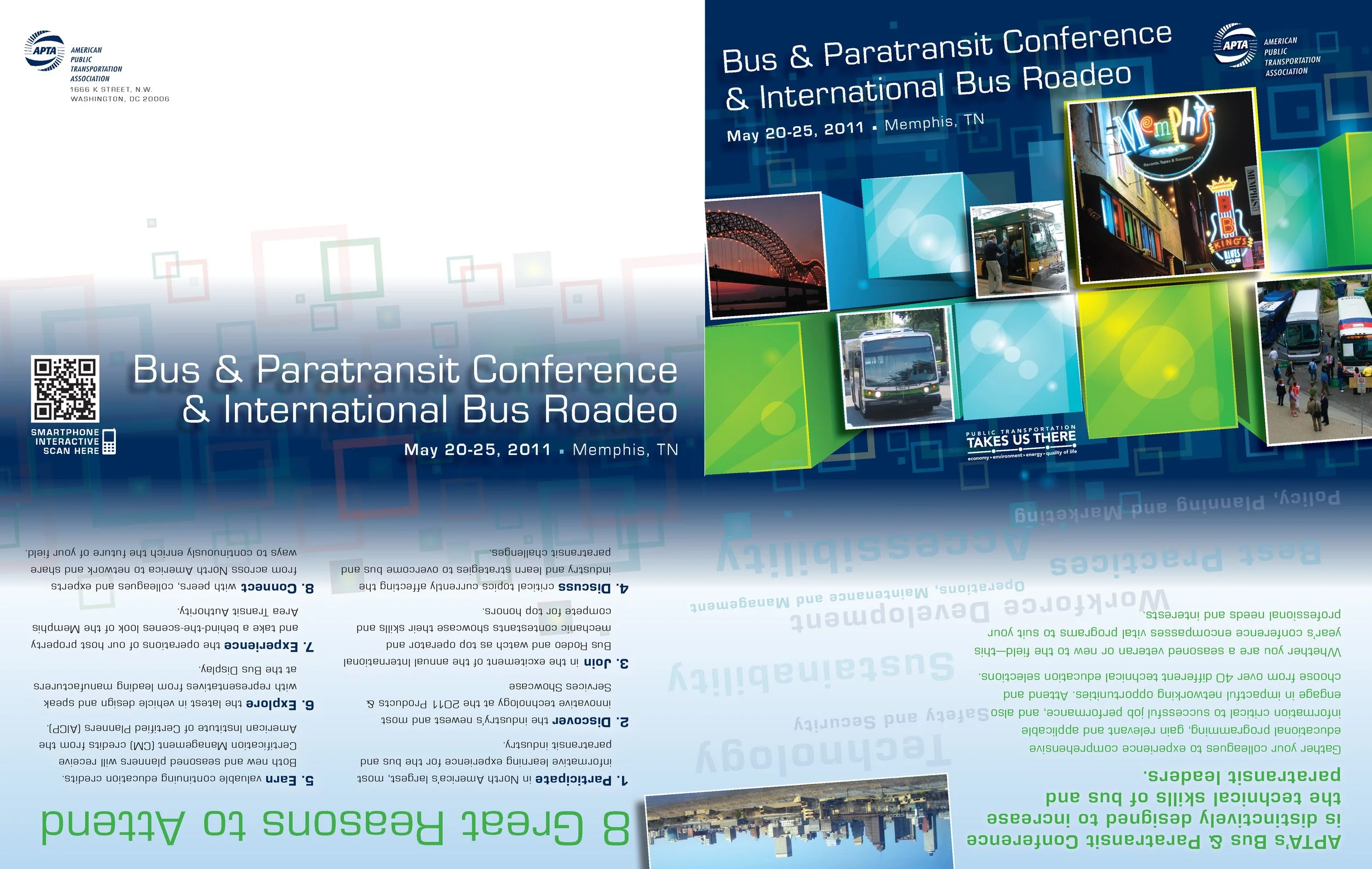
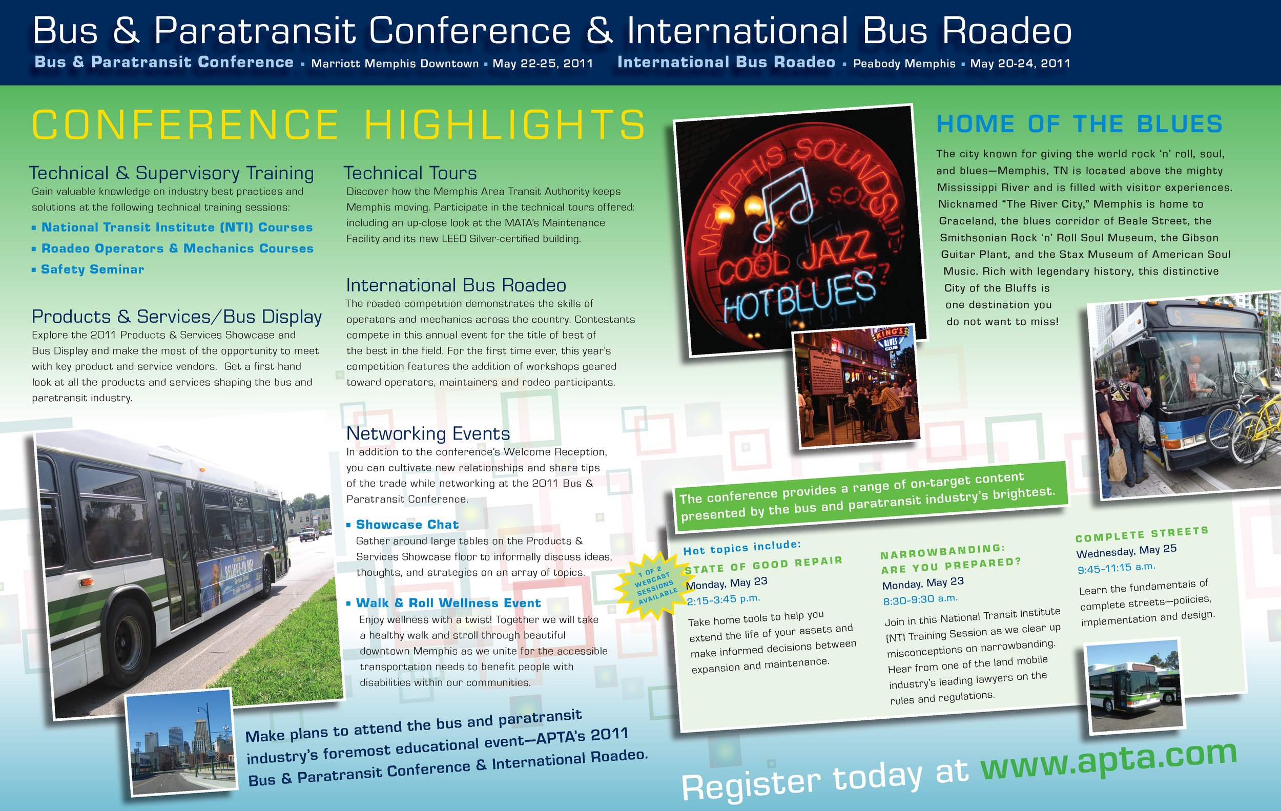
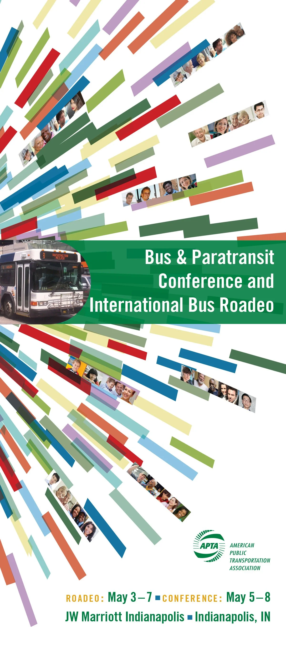
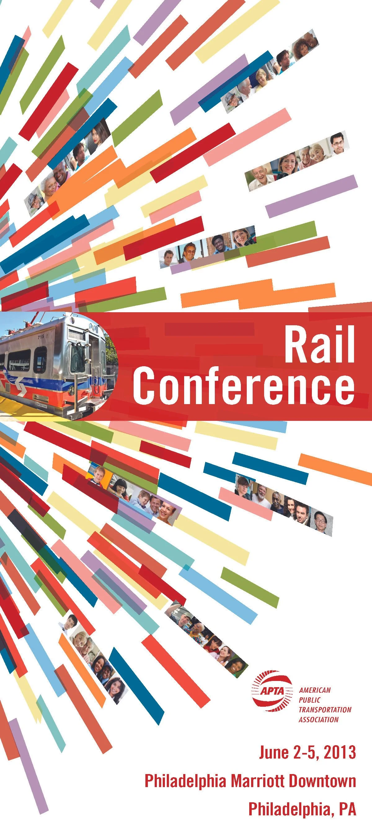
One of our favorite creative puzzles is the development of complex color palettes. With dozens of events ranging from the massive TRANSform Conference to specialized legislative summits, color becomes our most powerful navigation tool.
The Studio Red Strategy: We utilize sophisticated palettes to visually separate "major" from "minor" events. This allows members to instinctively understand the scale and tone of a meeting just by the hue of their badge or the header of an email before they even read a single word.
Seamless Integration: Cities, Logos, and Global Identity
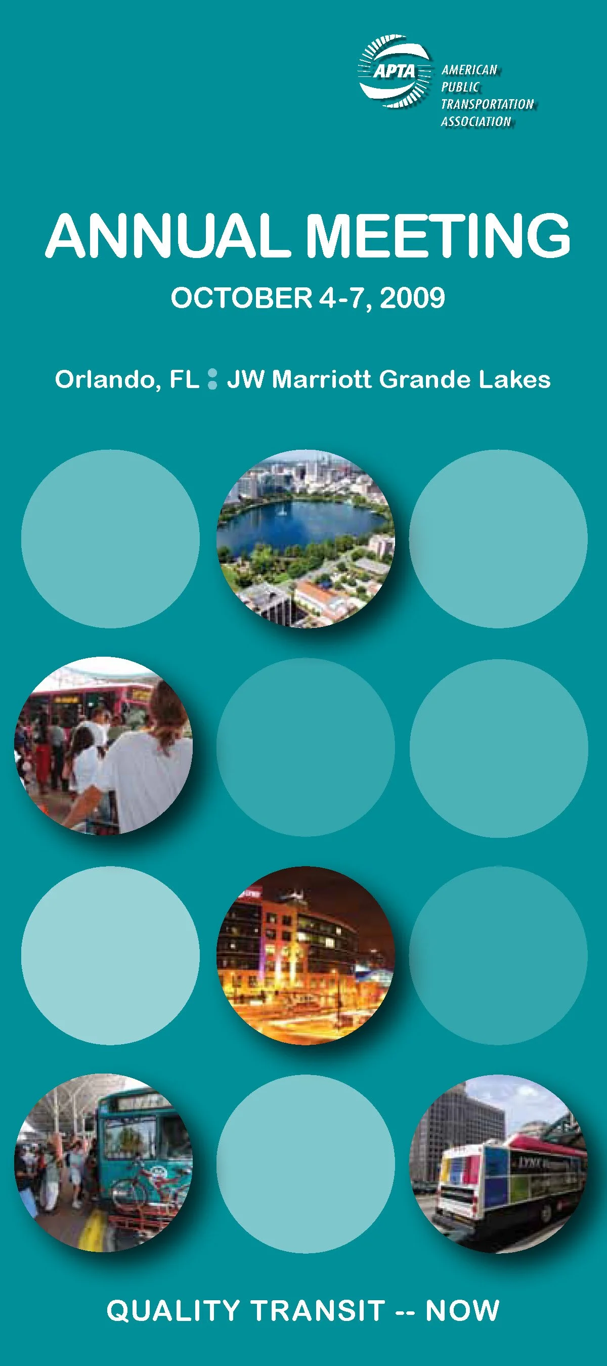
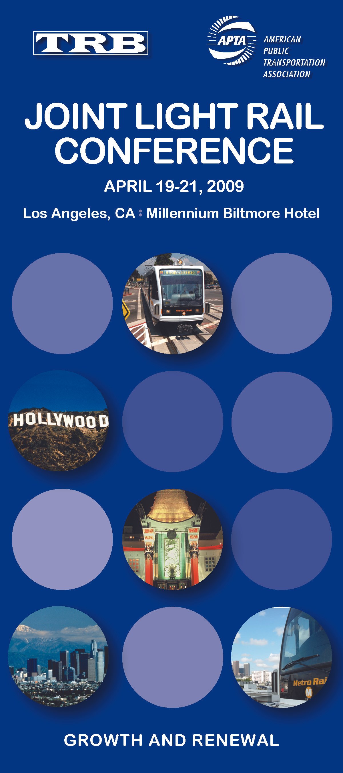
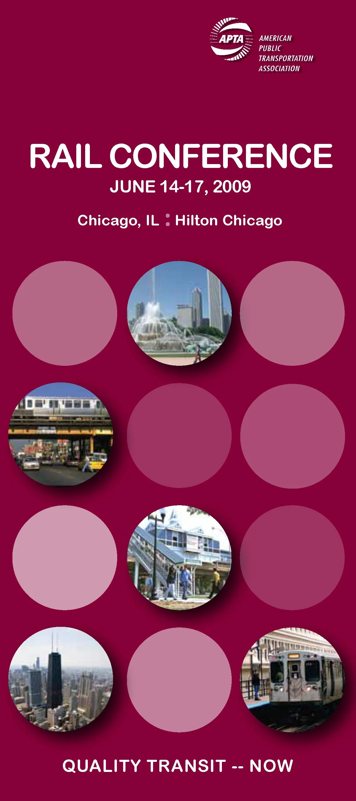
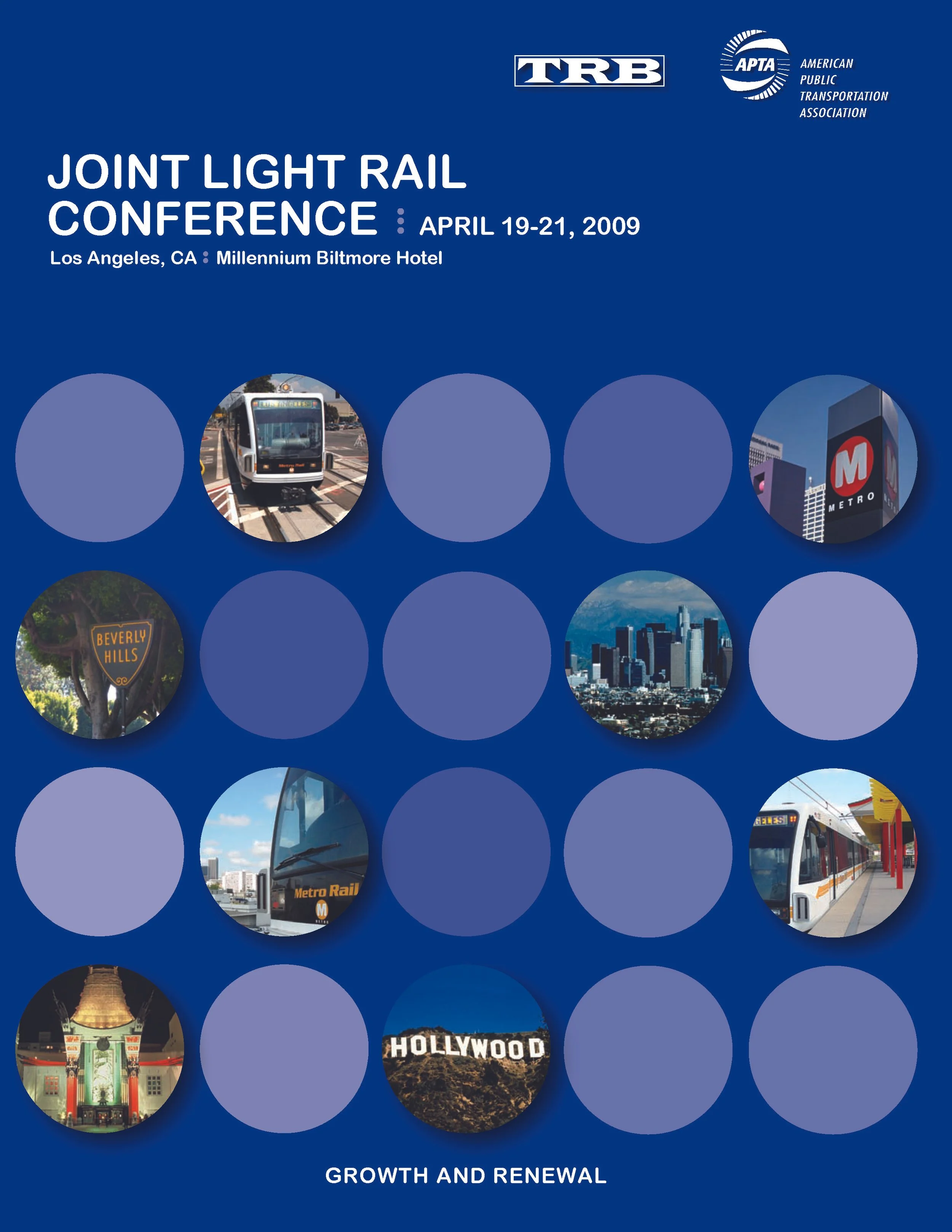
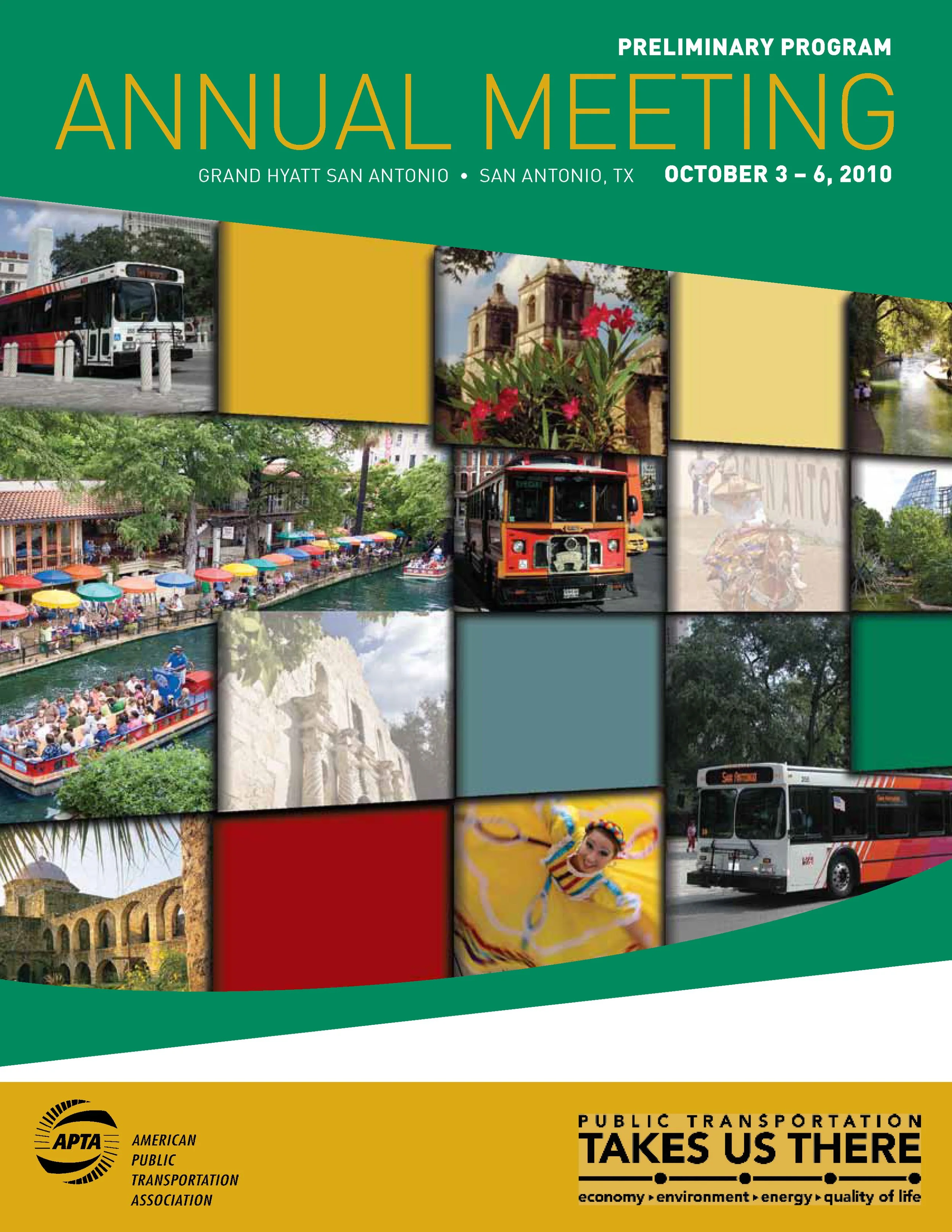
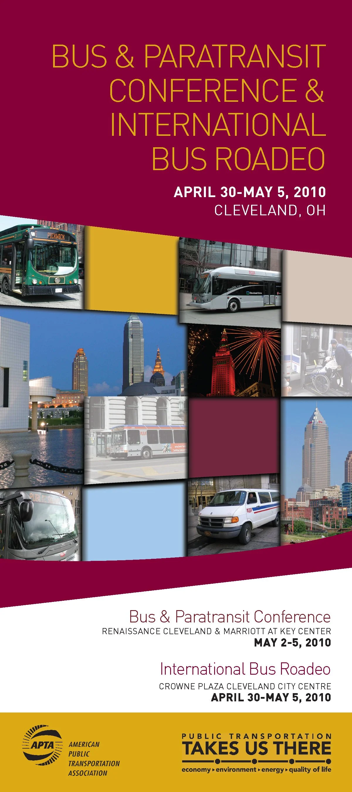
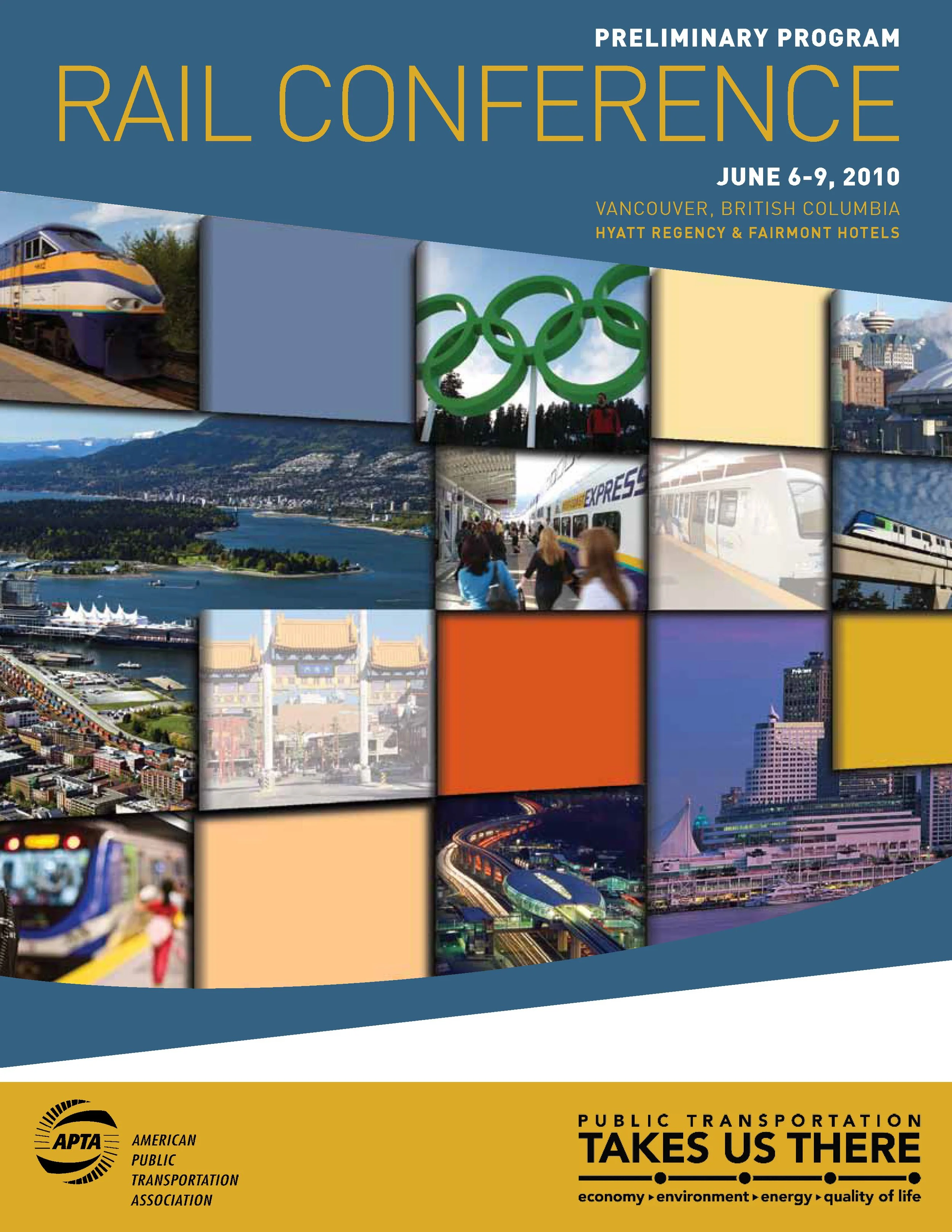
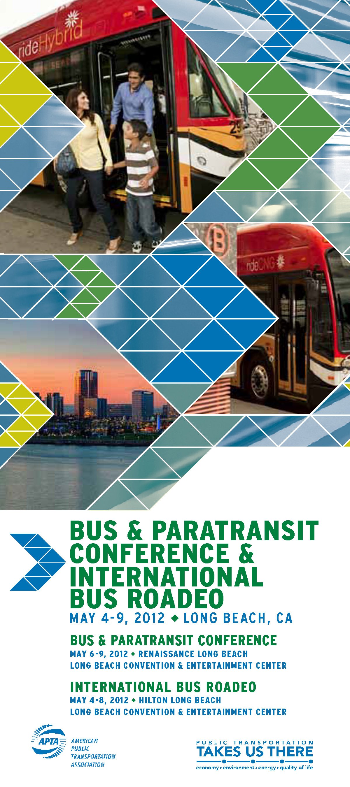
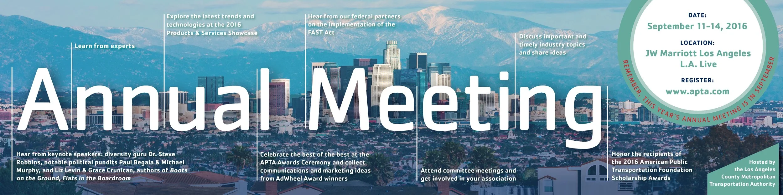
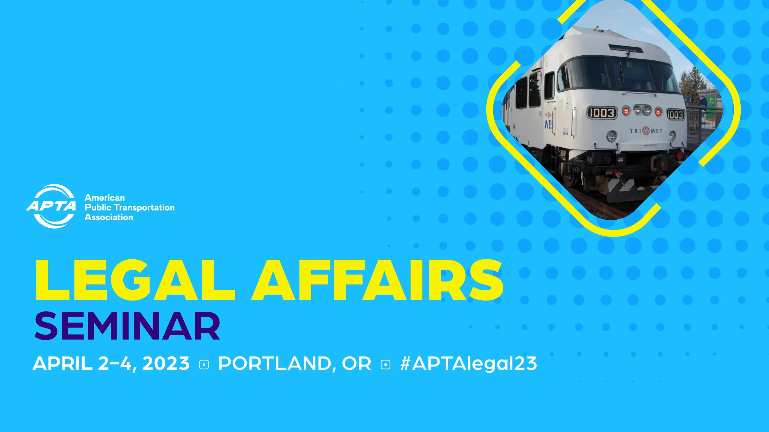
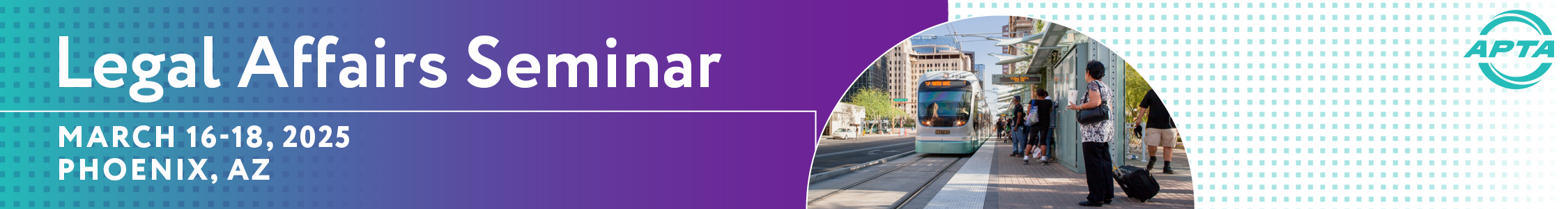
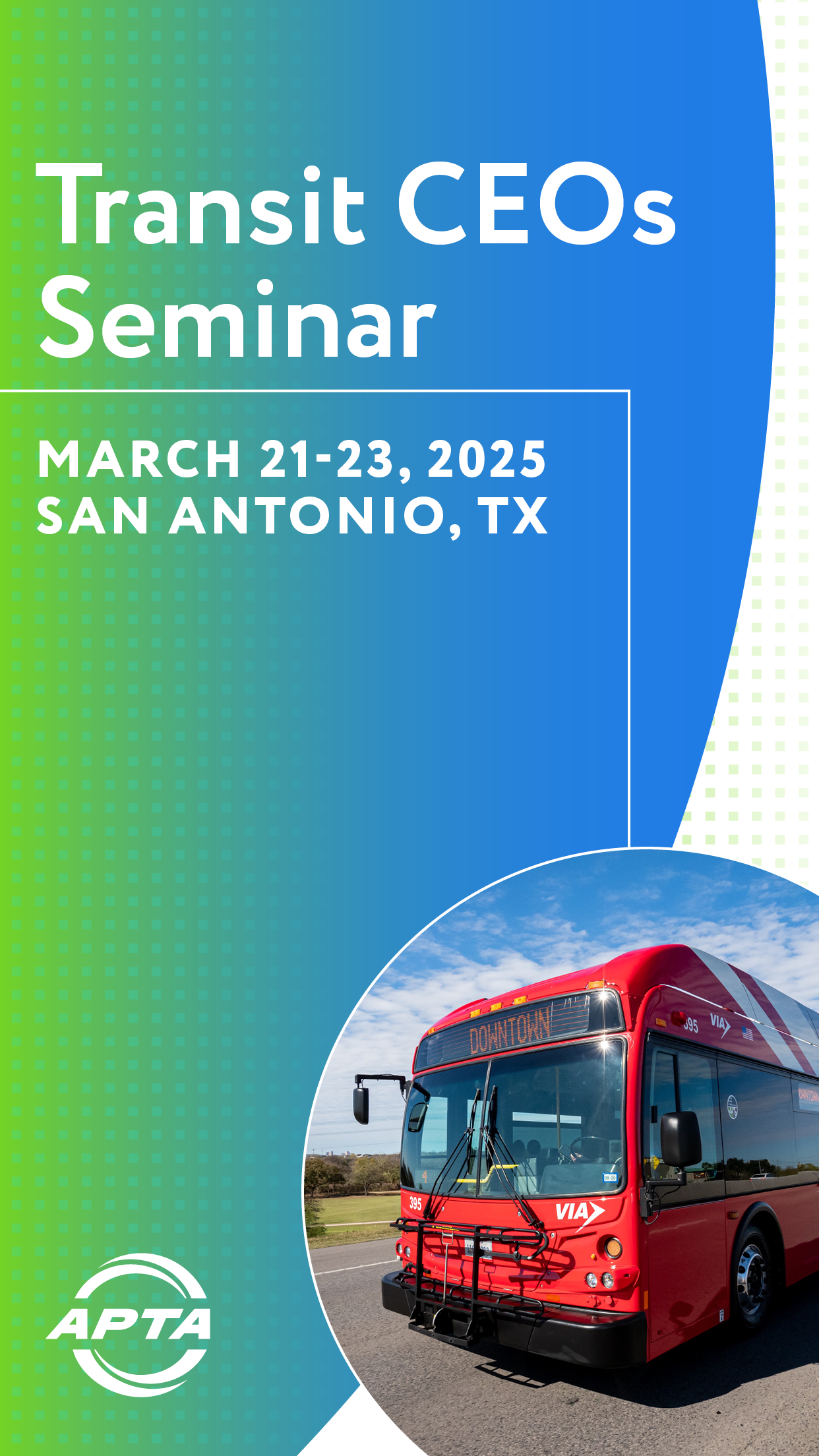
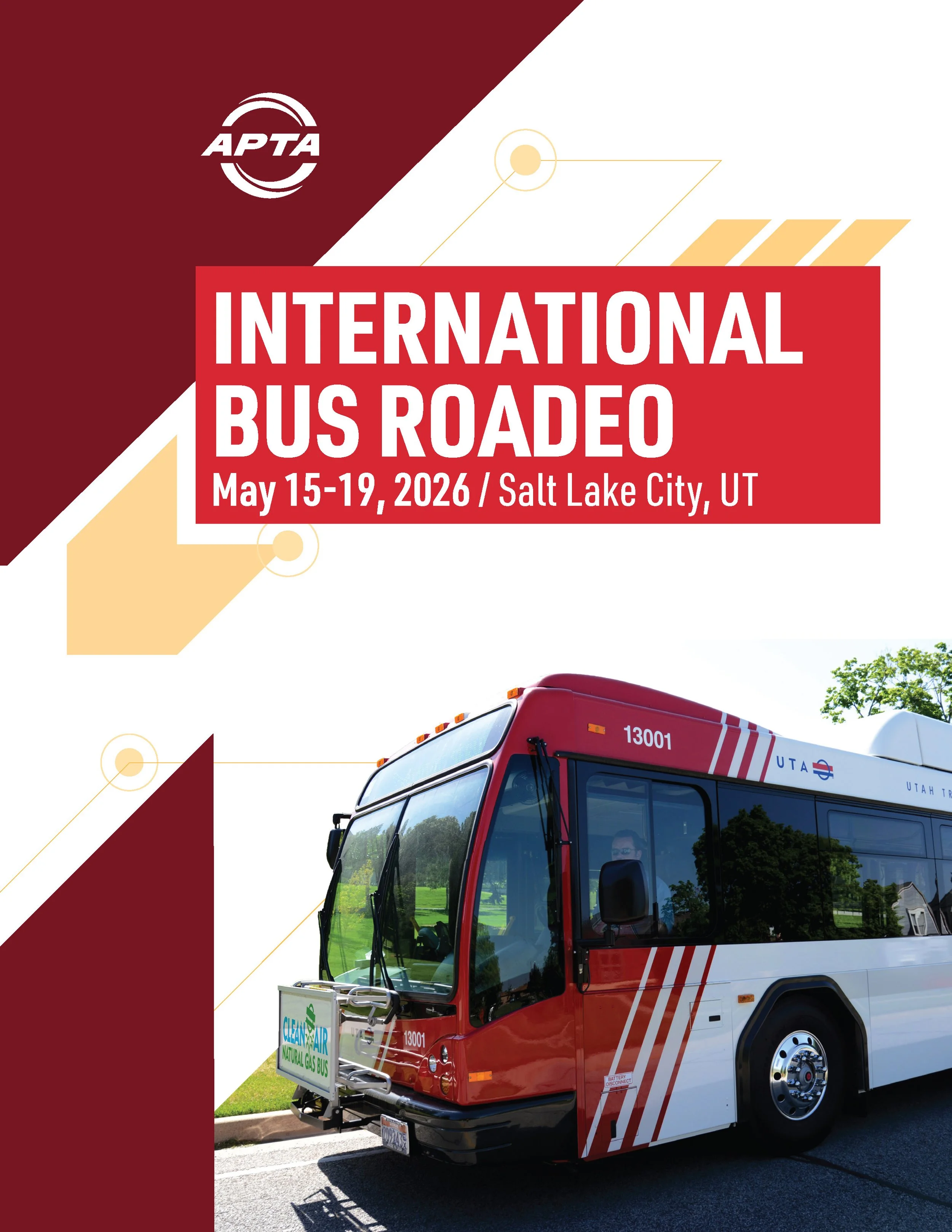
Perhaps the most technical challenge is the integration of city-specific imagery. Every year, the hosting city provides a suite of photography that must be paired with the APTA master brand, local agency logos, and various sponsor graphics.
Our goal is always seamless fashion. We don't just place a logo on a photo; we use movement-based patterns and strategic typography to bridge the gap between a city’s unique skyline and the association's professional identity. The result is a cohesive brand that honors the host location while keeping the focus firmly on the future of public transit.
Looking toward the future, we continue to find new ways to make the APTA voice heard, understood, and remembered through design that never stands still.t.
“I can’t tell you how many times you saved me, and you always, no matter how short the deadline, found the time to get done what I needed.”
—Jack G., American Public Transportation Association
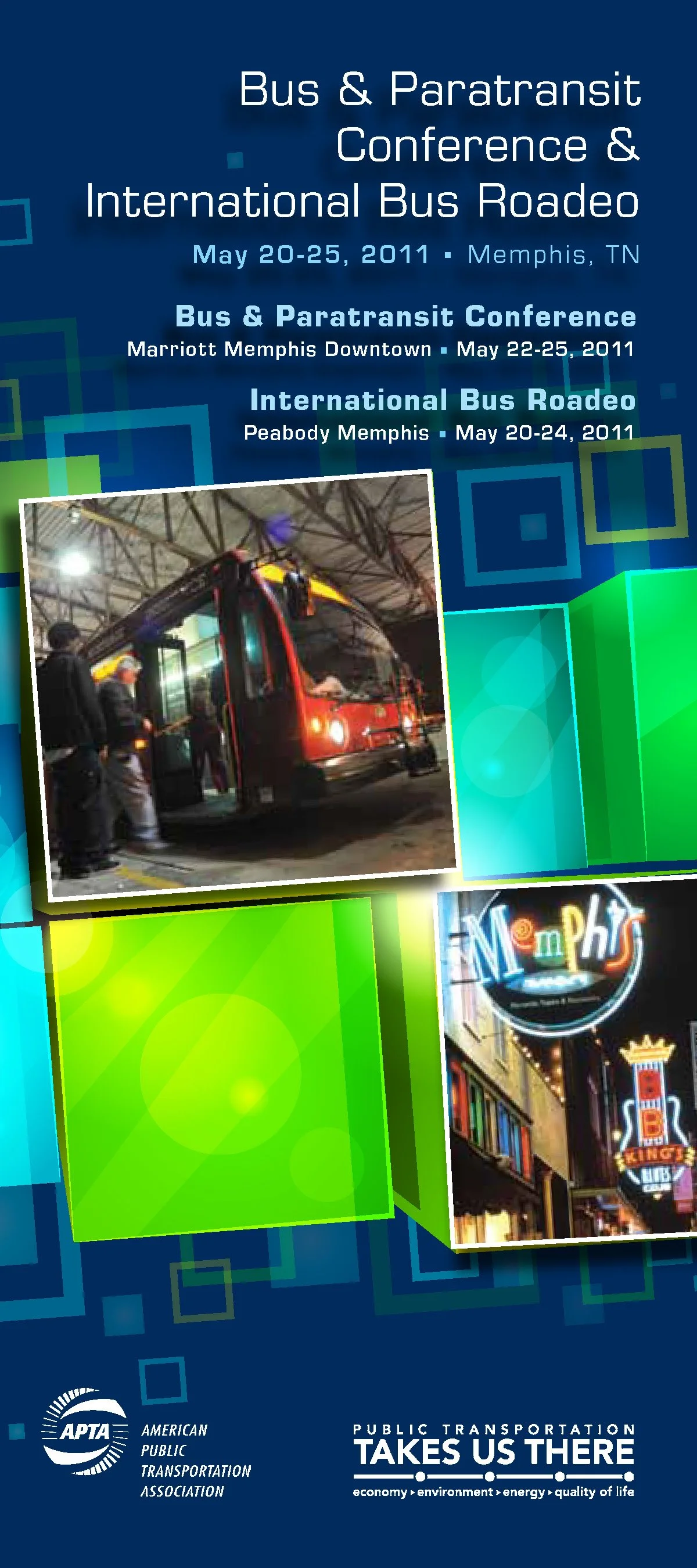
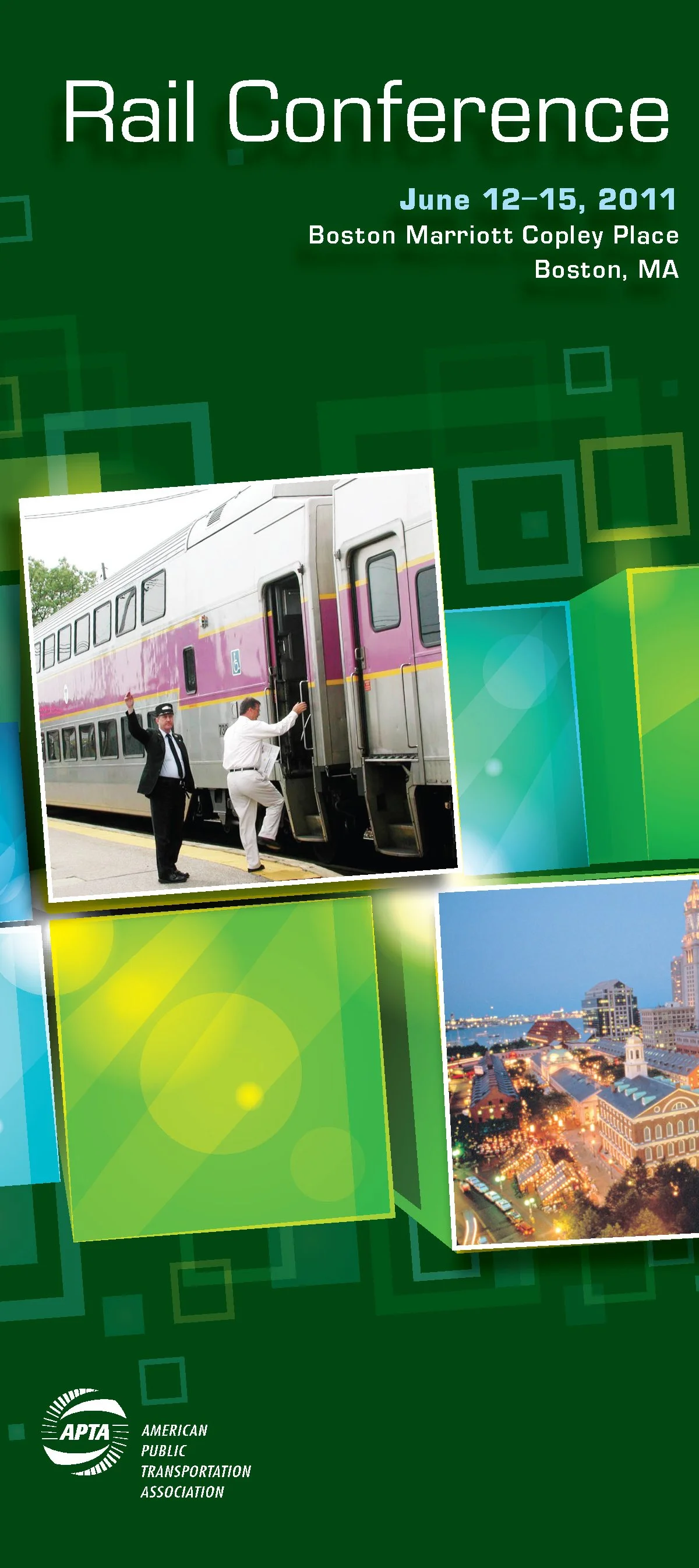
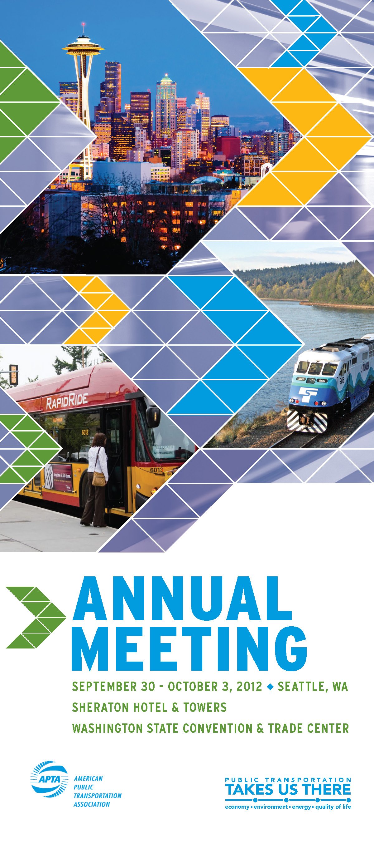
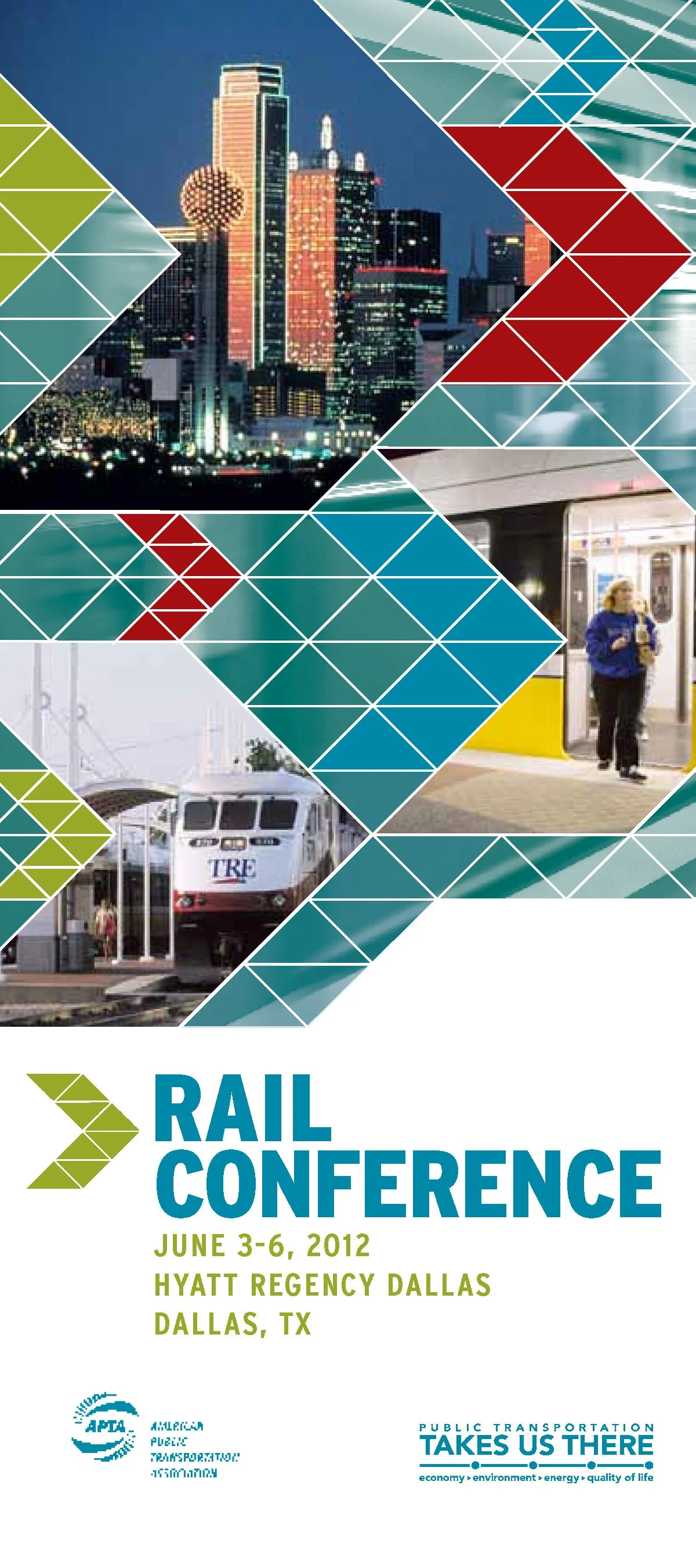
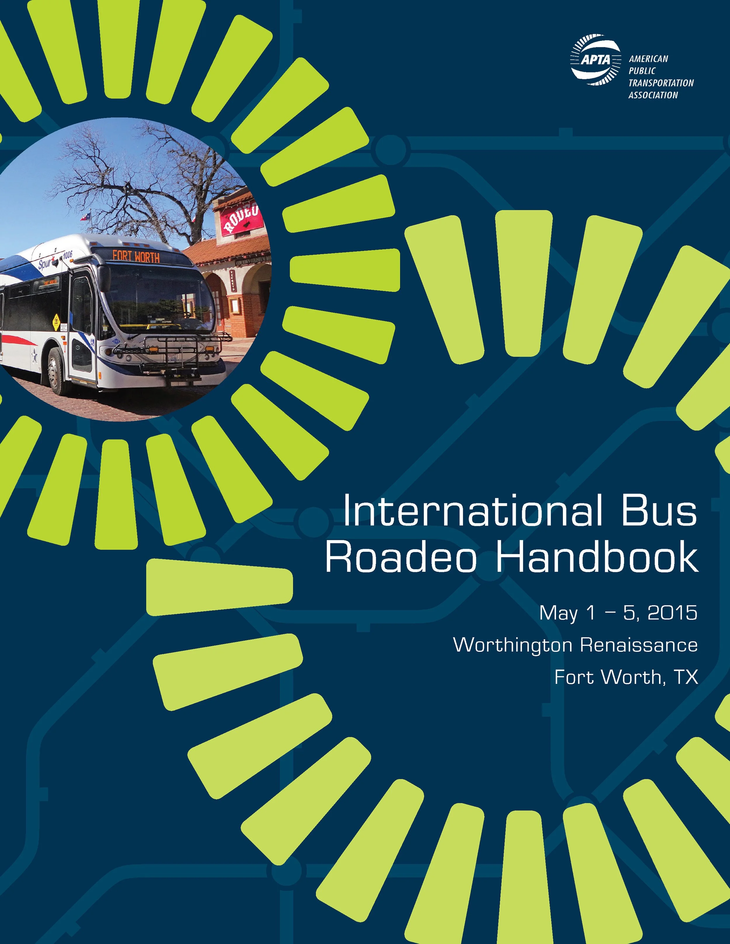
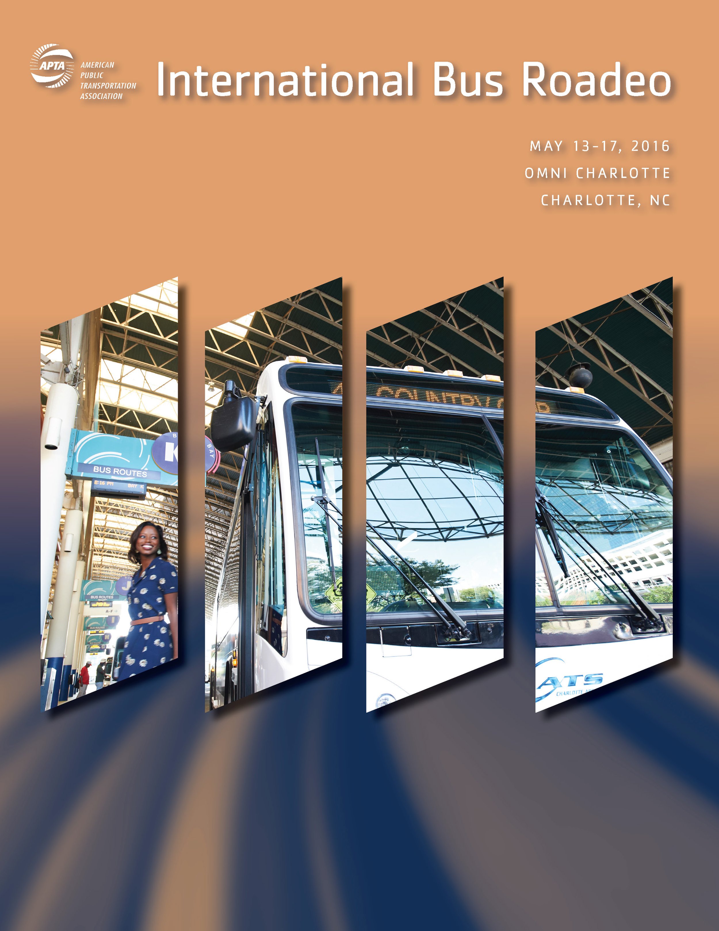
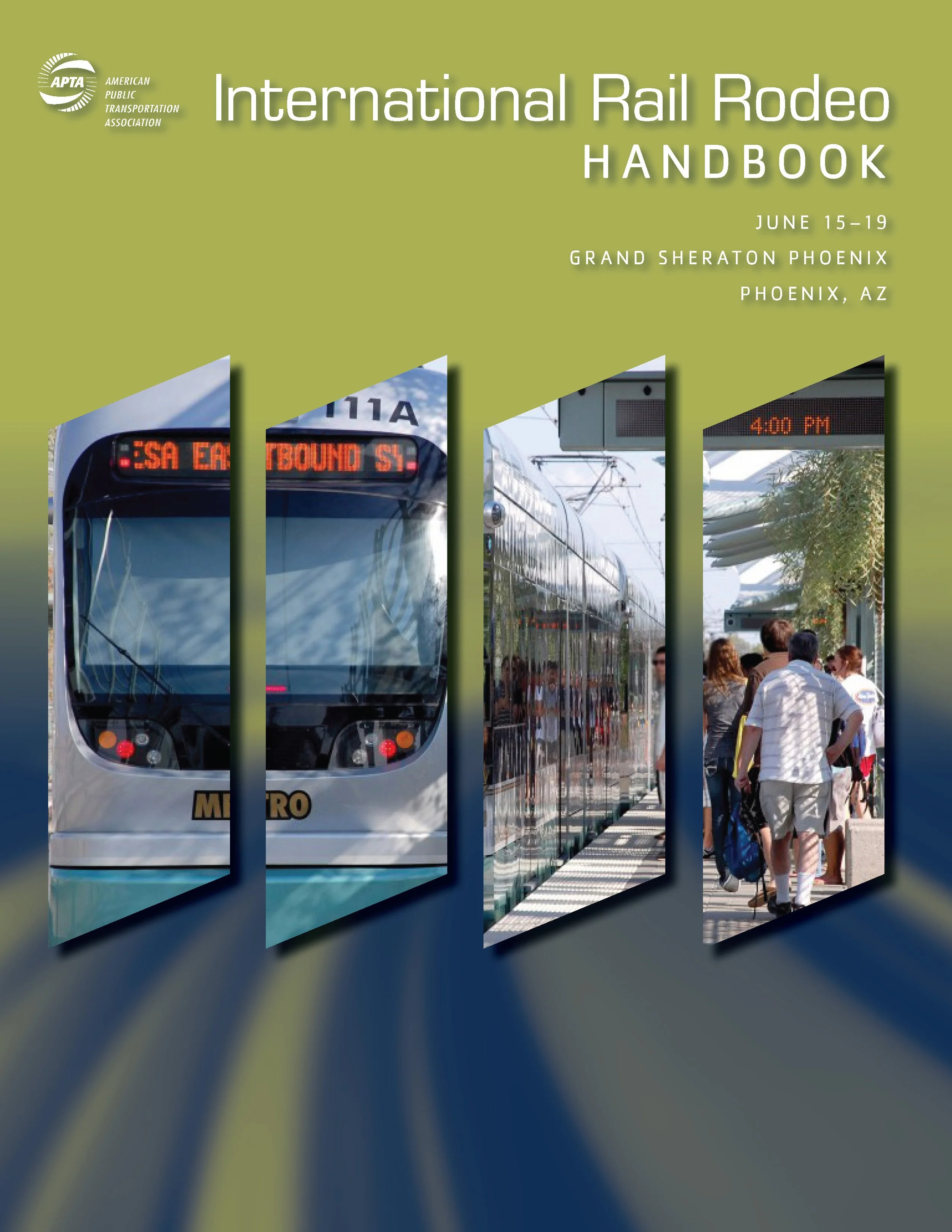
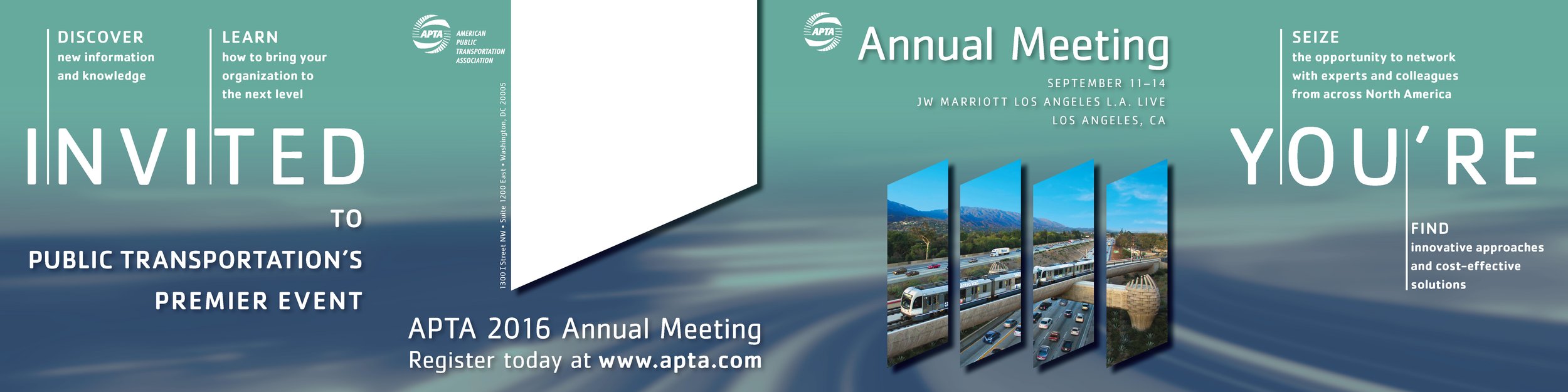
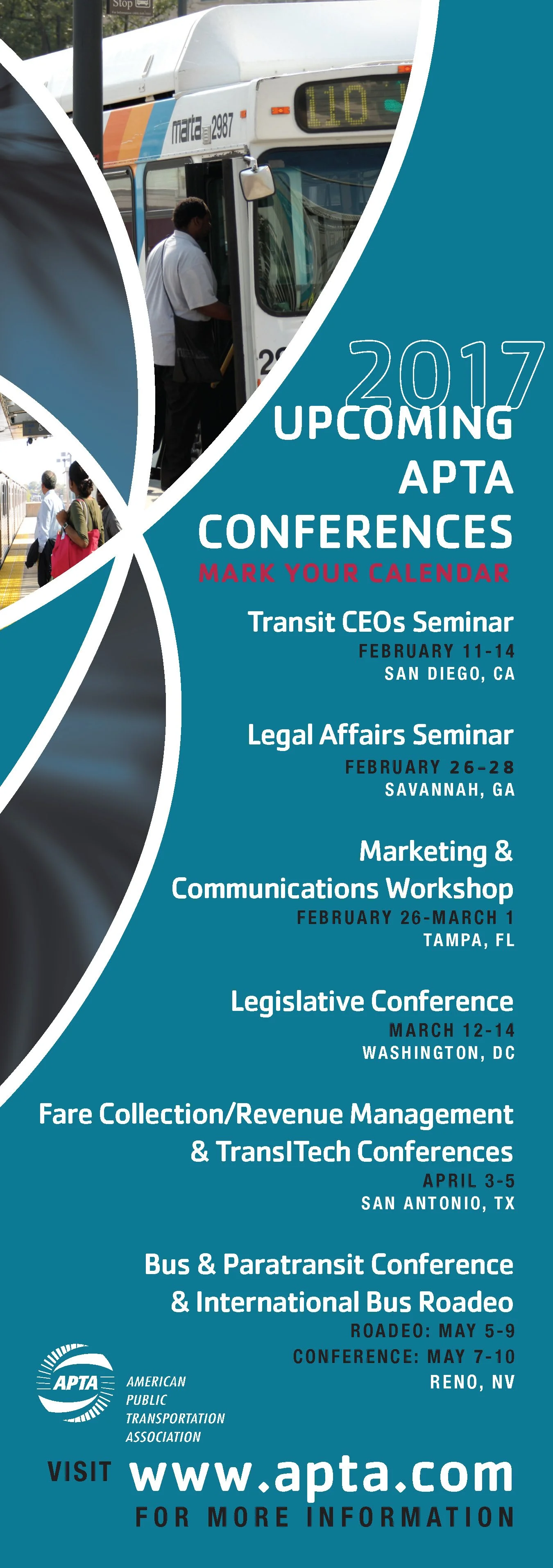
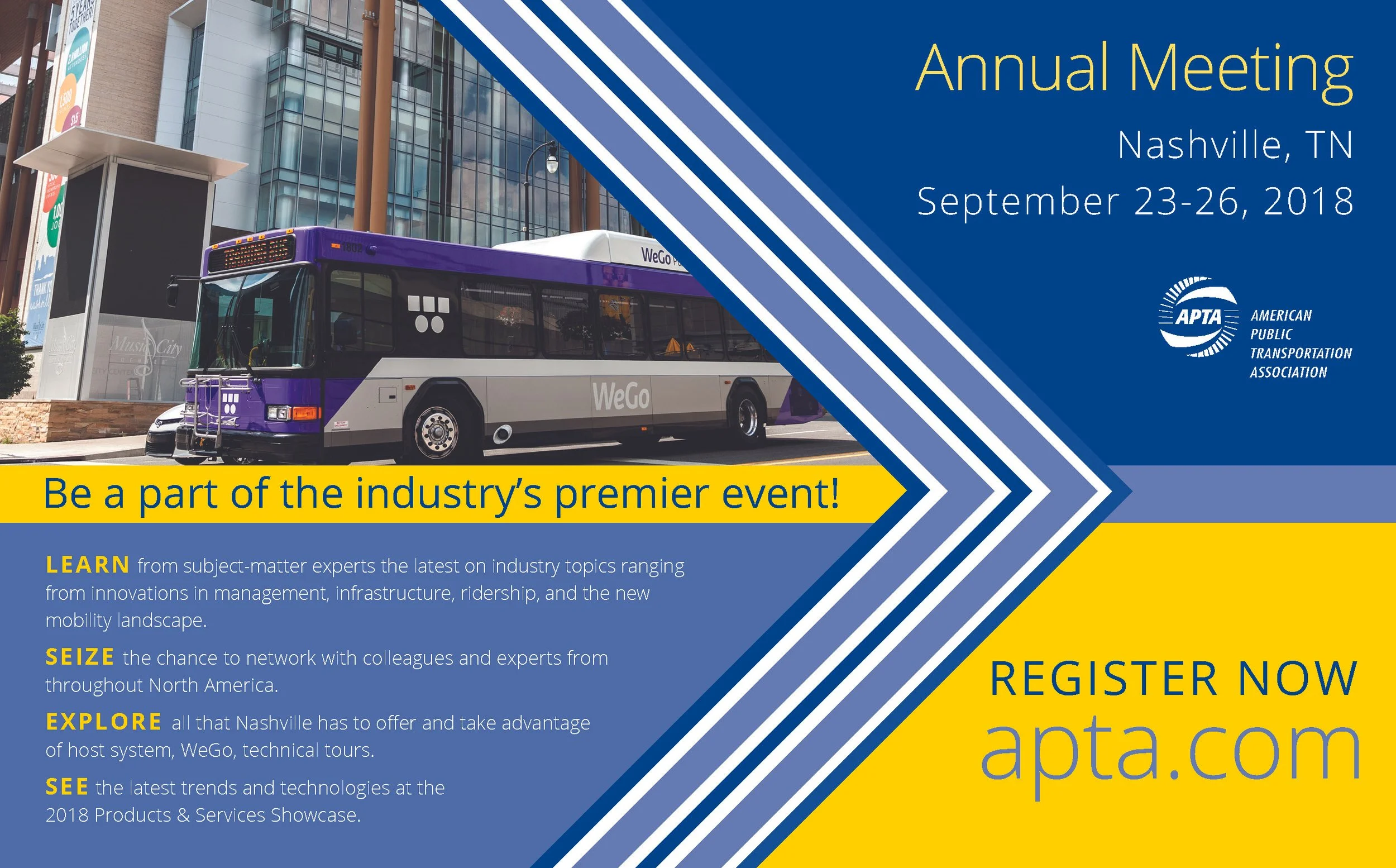
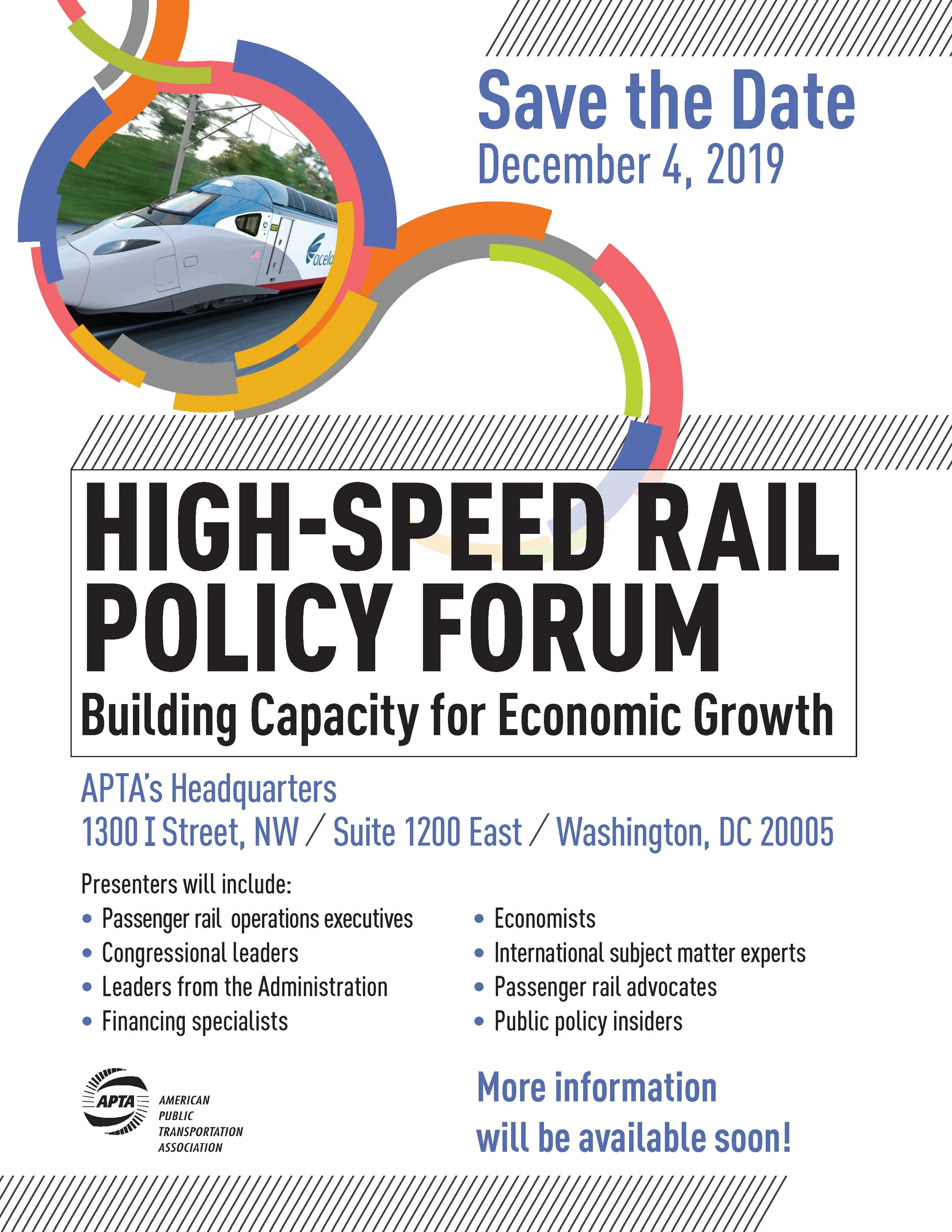
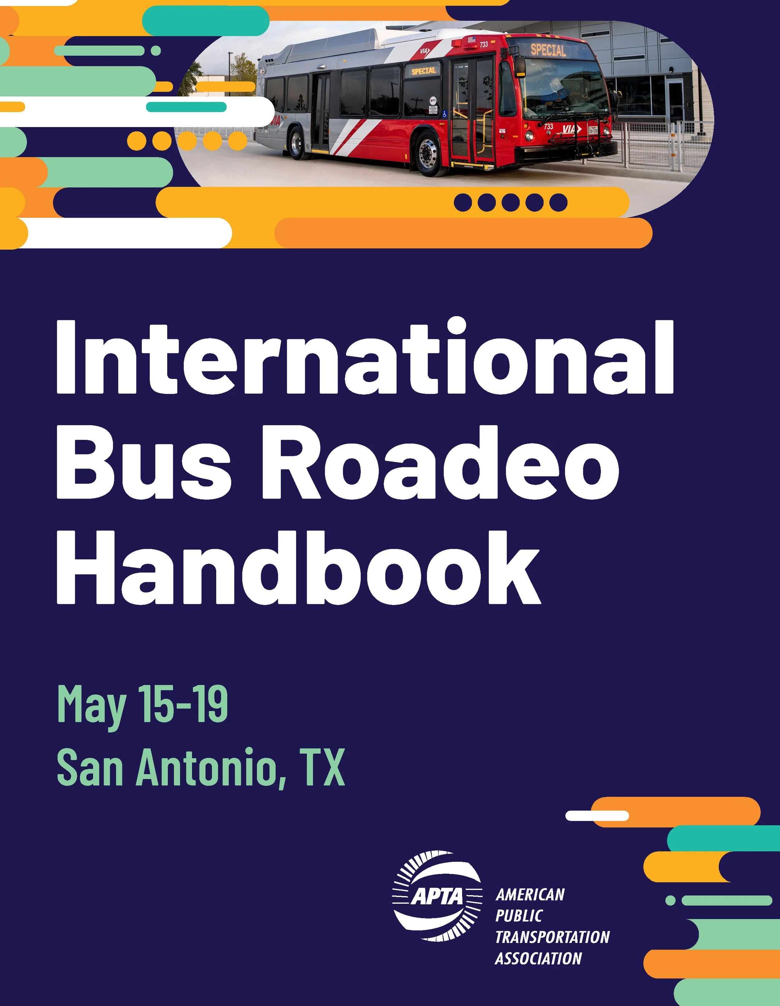
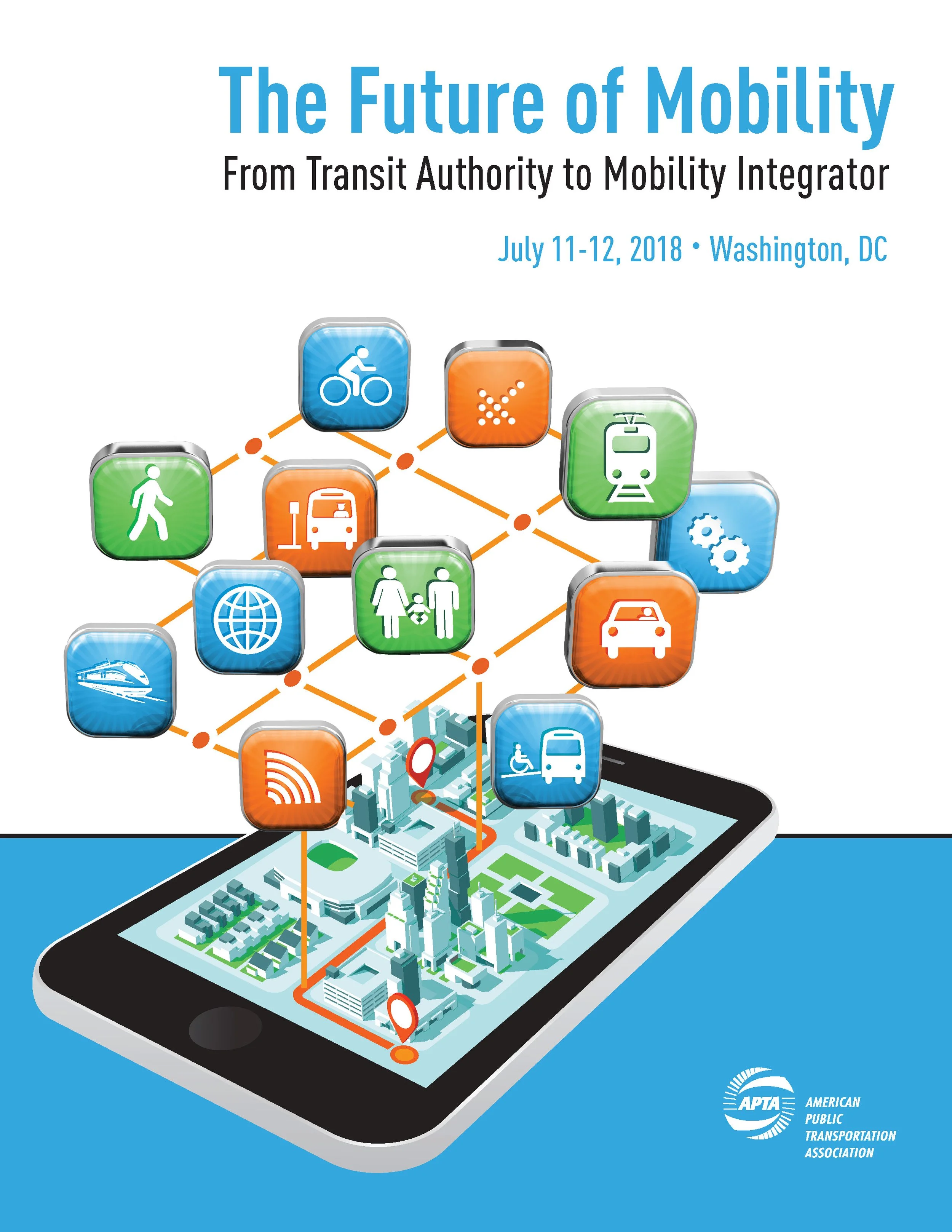
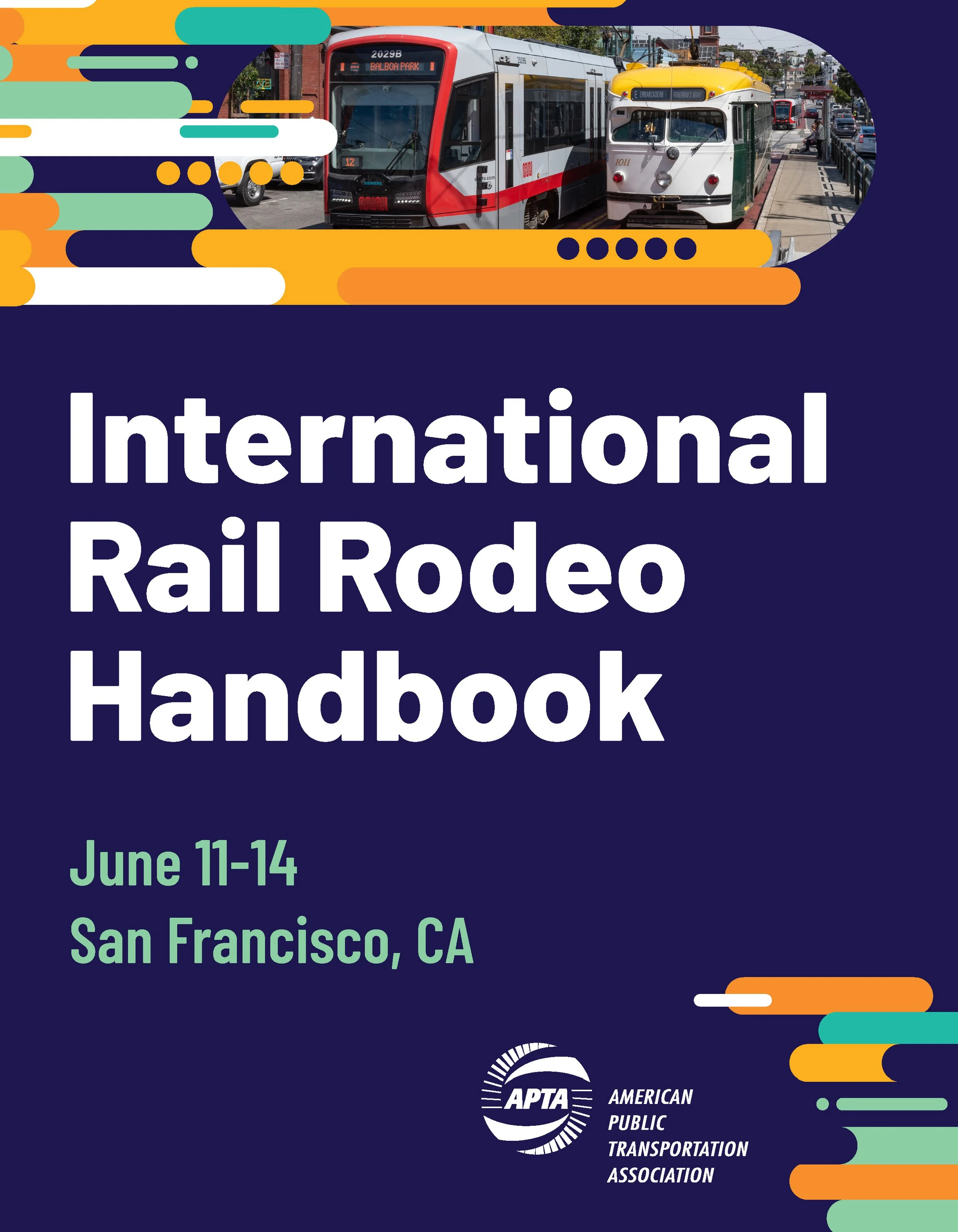
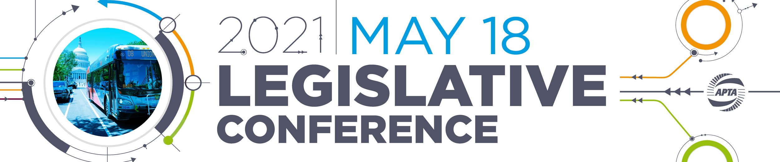
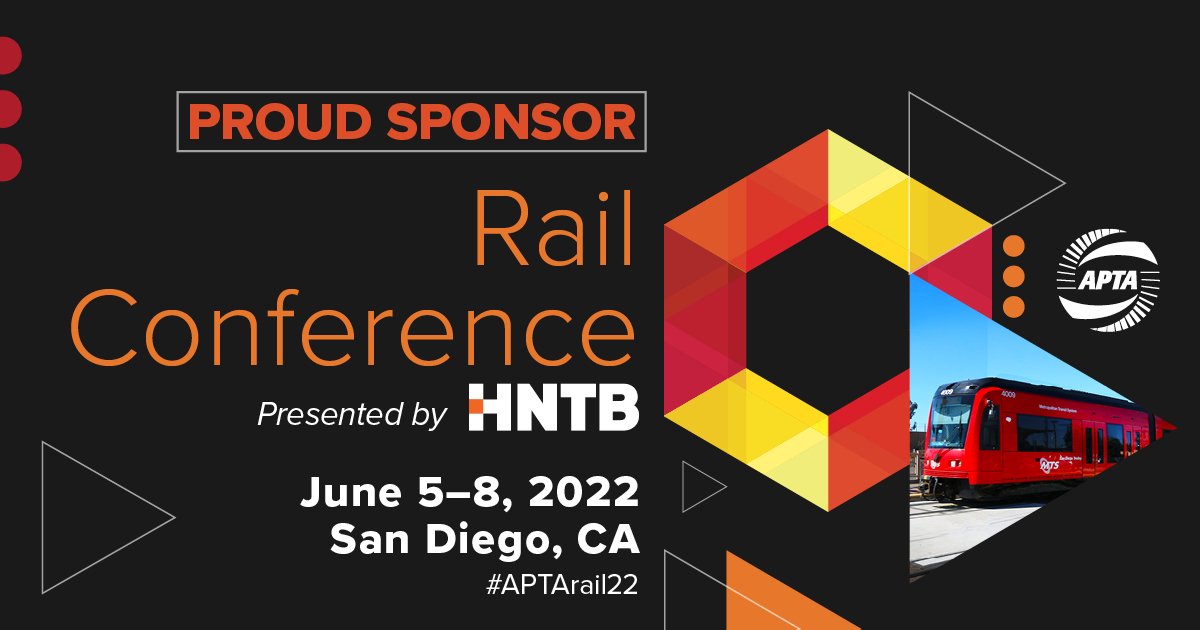
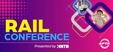
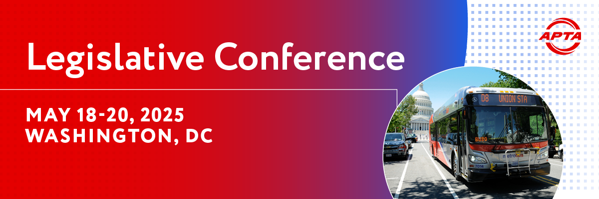
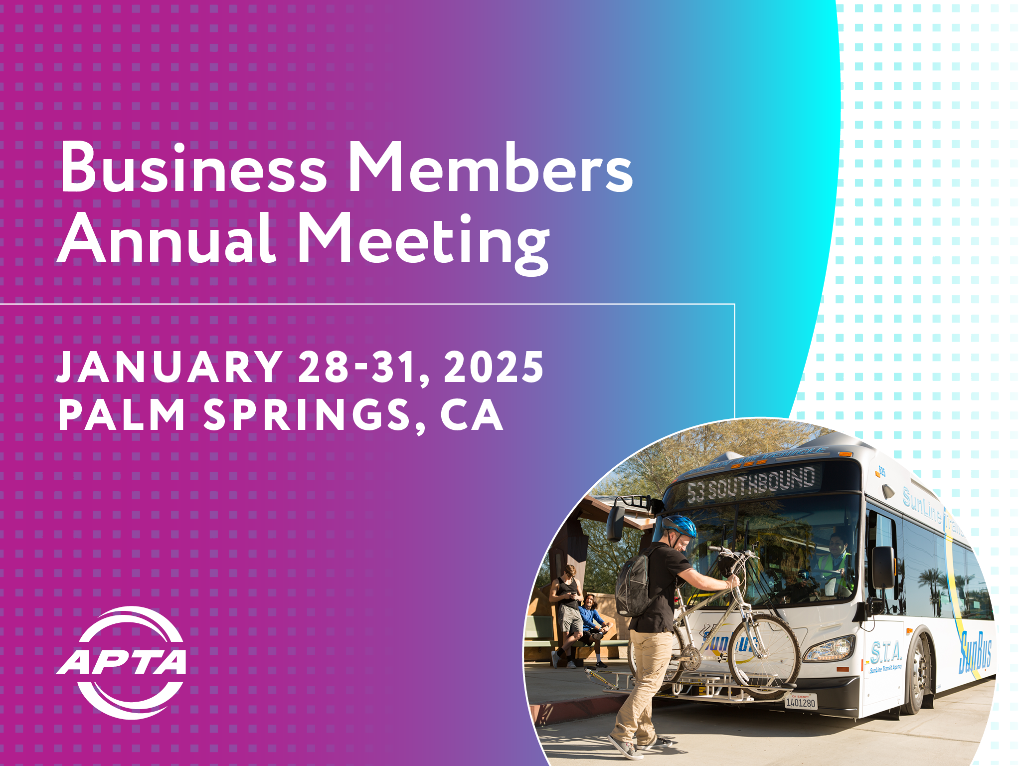
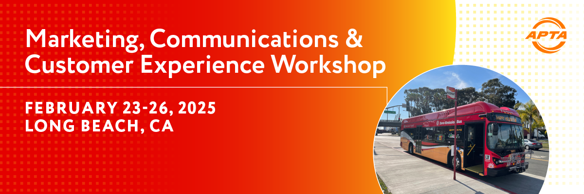
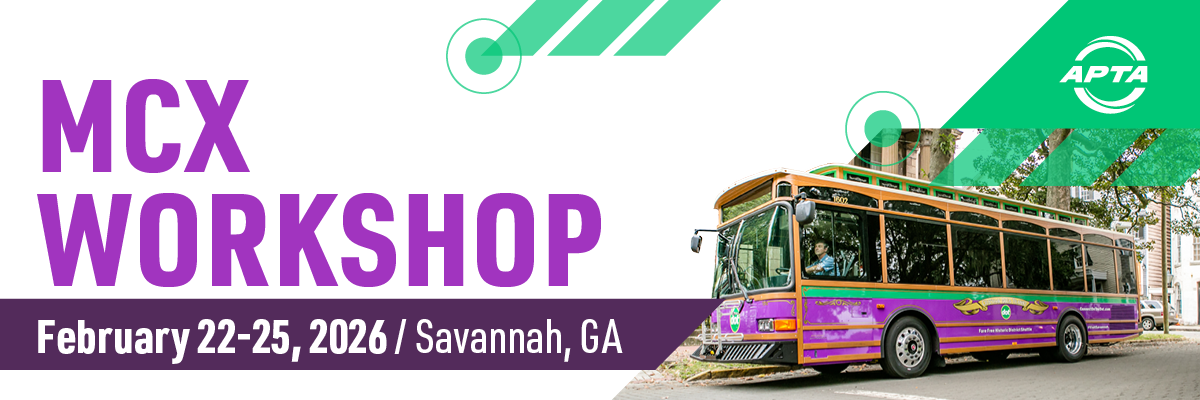
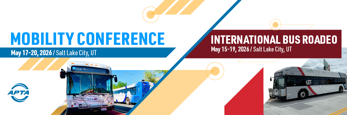
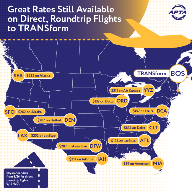
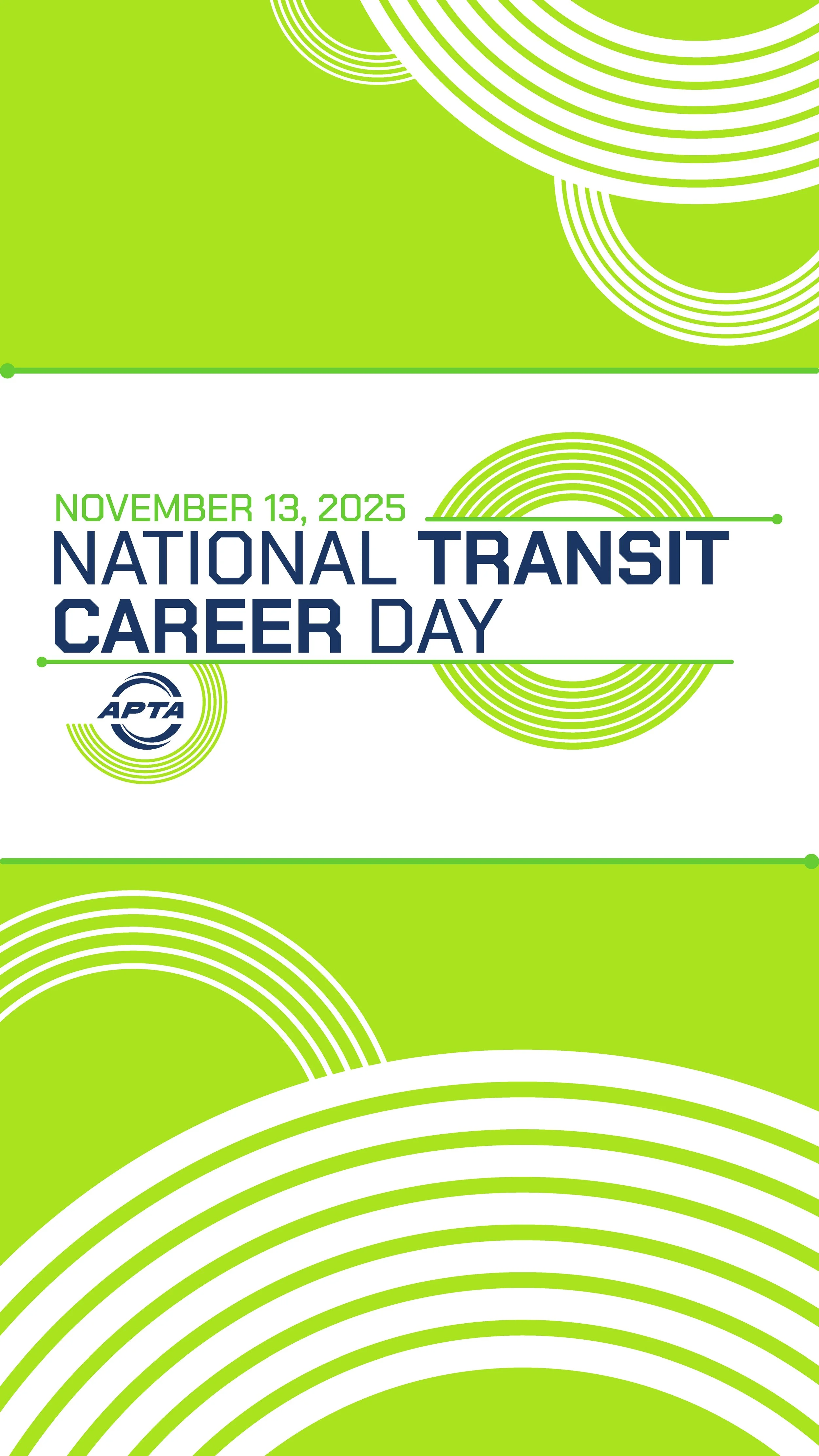
APTA Through the Years
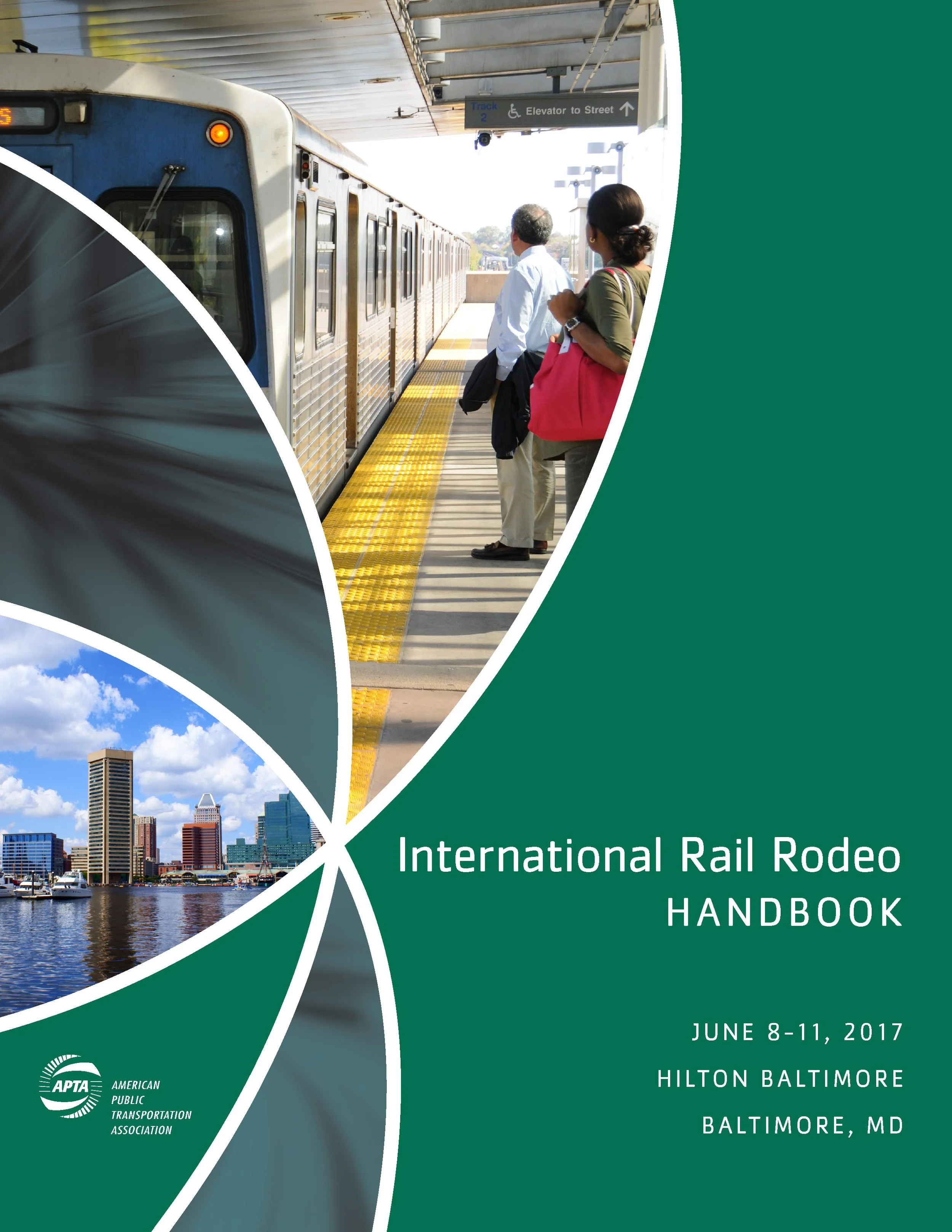
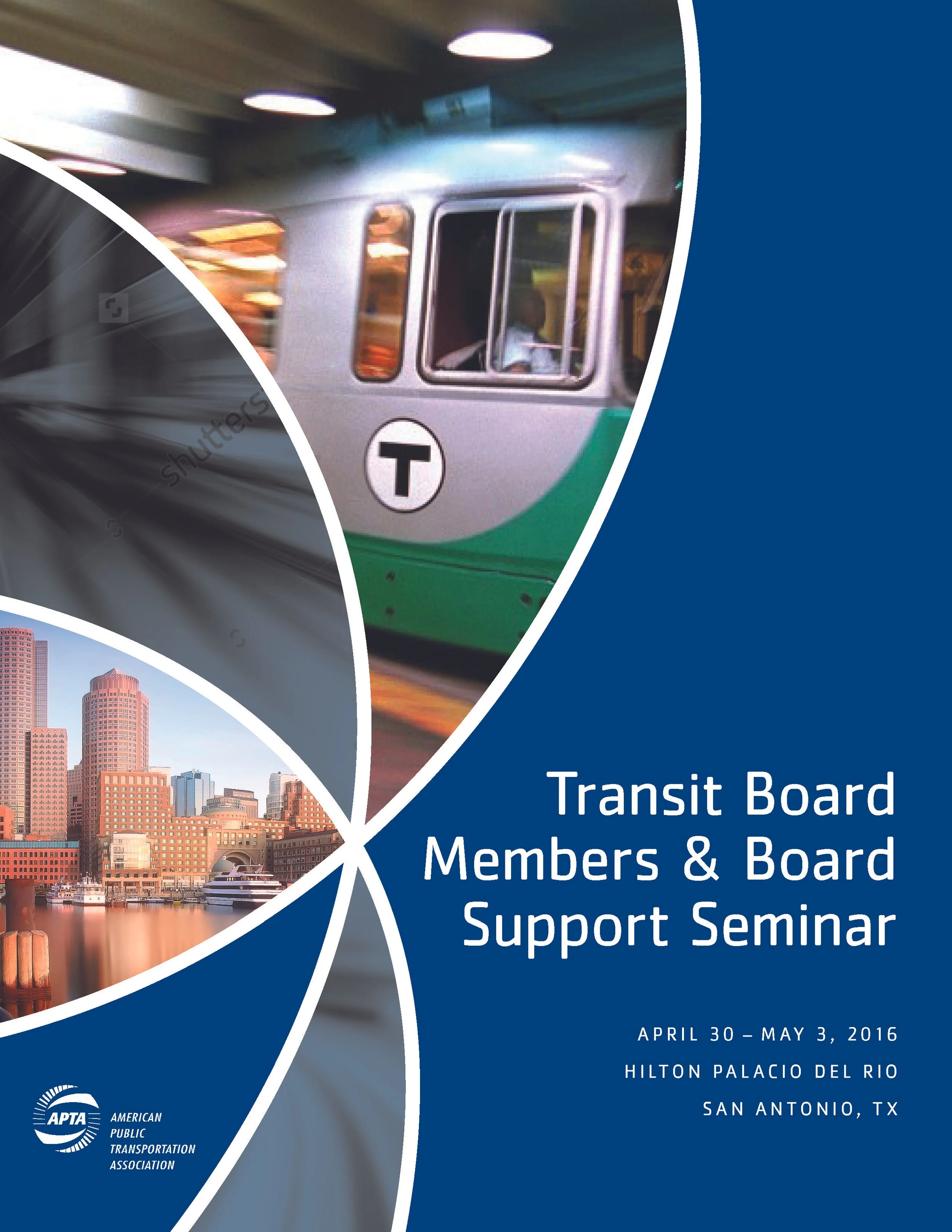
Below you’ll find examples of our work for APTA over the years. We’ve had the pleasure of designing the look over their conferences for almost 10 years. The work behind these projects range from designing the entire look from scratch to being provided the design elements and then spending time refining and improving upon the look until we reached the final specs. For example, from 2020-2022 we were provided with the overall look before we refined and implemented the designs across numerous projects. The 2025 conference look is one we developed based on an idea from our client.