
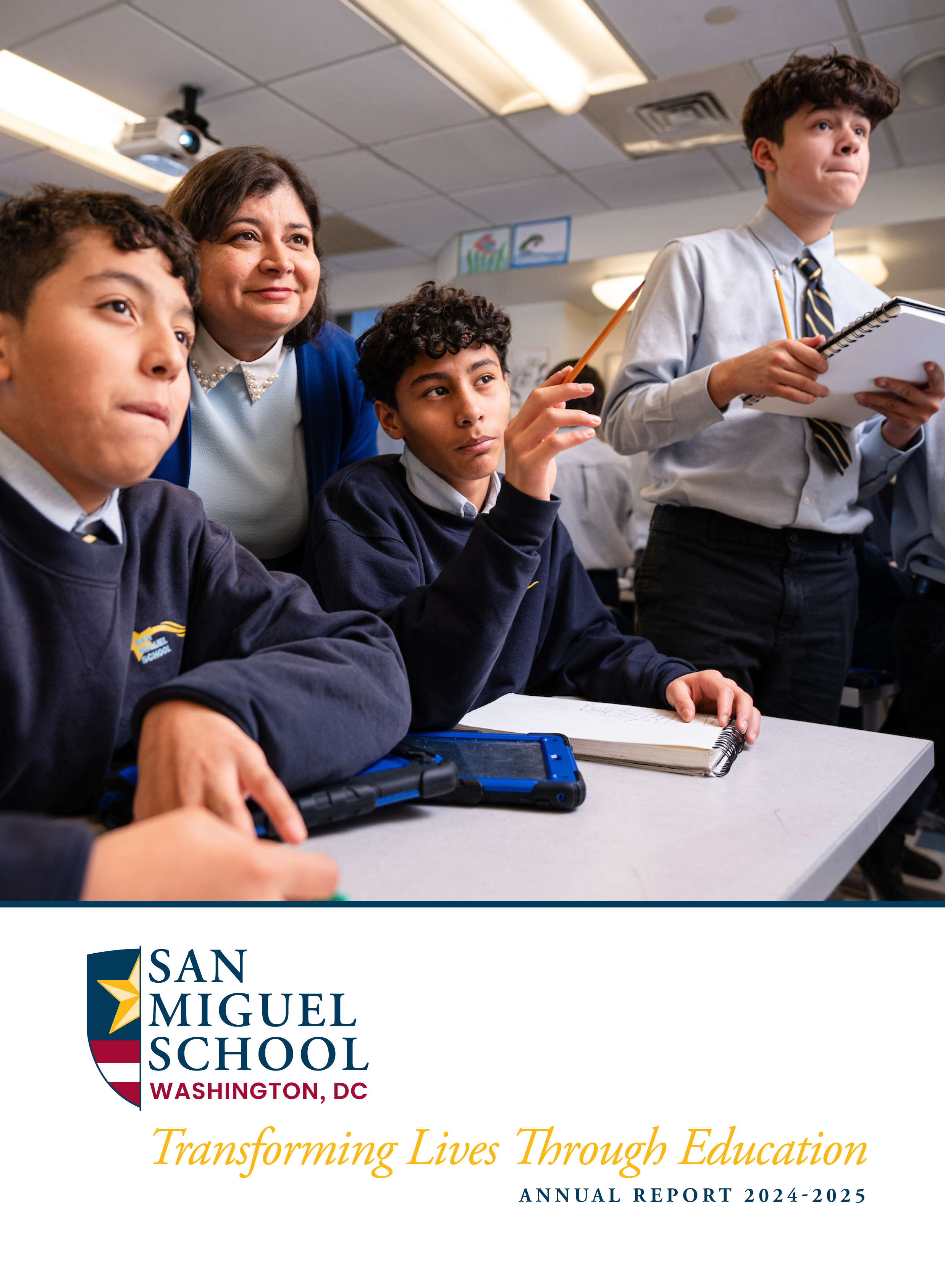
Studio Red Design knows an annual report holds a full year of work inside a handful of pages. Every program outcome, every dollar spent, and every milestone reached needs a spot on the page. Yet most readers give a report only a few minutes before setting it down. Design decides whether those minutes get used well. Skilled annual report design services in Washington turn a stack of facts into a document people actually want to open, read, and remember.
The Gap Between Information and Engagement
A report can hold excellent work and still fail to connect. Dense paragraphs, tight margins, and uneven pacing push readers away before they reach the strongest content. Engagement depends on how information gets shown, not just what gets included. A well-paced report guides the reader forward one page at a time, instead of dropping every fact on them at once.
Setting the Right Pace From Cover to Close
Pacing shapes how a reader moves through the whole document. A report that opens with a wall of text loses steam fast. A stronger structure moves through clear, deliberate stages.
Opening spread: Sets tone and mission right away, giving readers a reason to keep reading past the first page.
Story-driven pages: Show impact through real examples, pairing photos and short quotes with the program work behind them.
Data spreads: Back up those stories with clear numbers, using charts instead of dense paragraphs full of figures.
Closing section: Thank supporters and point forward, ending the report on a warm, forward-looking note.
Visual Hierarchy Guides Where Eyes Land First
Not every piece of content deserves equal visual weight. A strong headline should draw the eye before a supporting paragraph does. A key statistic should stand out more than a footnote. Visual hierarchy uses size, placement, and contrast to show readers what matters most on each page, without making them hunt for the point buried in dense text.
Bringing Numbers and Images to Life
Reports need both proof and feeling to truly land with readers. Numbers show results. Photography and charts each play a distinct role in making those results memorable and easy to grasp.
Photography That Adds Weight to the Numbers
A photo of a real person tied to a program gives numbers a face and a story. Candid, honest images hold attention longer than posed shots ever do.
Charts and Graphs Built for Quick Understanding
Good data visuals strip away decoration and highlight one clear trend per graphic. Simple bar comparisons and direct labels help readers grasp meaning within seconds.
Balancing Visual Weight Across a Spread
Photos and charts should never compete for the same space. Giving each element its own zone keeps a page from feeling crowded or confusing.
Why Non-profit Reports Face Unique Pressure?
Nonprofit groups answer to a wider circle than most businesses. Boards want transparency. Donors want proof their gifts created real change. Staff wants a document that still feels genuine despite all the required disclosures. Thoughtful Nonprofit annual report design balances these needs. It gives financial sections a clean, trustworthy look while letting program stories carry warmth elsewhere in the same publication.
Consistency Builds Recognition Year After Year
A report that changes its whole look every year confuses longtime readers. Keeping certain pieces steady helps donors spot the publication right away, building trust across repeated reporting cycles.
Color palette: Stays recognizable year over year, so donors connect the look instantly with the organization behind it.
Typography choices: Remain steady across issues, keeping the reading experience familiar even as content shifts annually.
Section order: Follows a repeatable pattern, letting returning readers find familiar content without relearning the layout each time.
Working With a Local Studio That Understands the Region
Groups searching for annual report design services in Washington gain something extra from a studio familiar with the region's policy groups, research institutes, and advocacy organizations shaping local expectations.
What the Design Process Looks Like
A strong report follows a clear sequence from start to finish. Each stage builds on the last, keeping the project organized and the final file ready well before any printing deadline.
Content Review and Mapping
The process starts with a full content review, mapping out sections before any layout work begins on the page.
Draft Spreads and Structured Feedback
Draft spreads follow next, giving clients something concrete to react to during structured, organized feedback rounds.
Refinement and Revisions
Feedback shapes a second round of refinement, tightening layout choices and fixing small details before anything moves toward final files.
Final Production Files
The last stage produces final files ready for both print vendors and digital platforms, checked closely before release.
Ready to Give Your Report the Attention It Deserves
If your organization wants a report that reads clearly and shows a full year of hard work with honesty, Studio Red Design would love to talk. Reach out today to start planning your next annual report or reporting cycle.
Frequently Asked Questions
-
Most projects take eight to twelve weeks from start to finish, based on content readiness and feedback rounds. Larger reports with complex data sections may need extra time for accuracy checks.
-
Yes. Project scope adjusts to fit real nonprofit budgets, keeping strong craft intact. Smart file setup also lowers costs for future reports, since templates and brand assets stay ready for reuse.
-
Most reports serve both needs today. A print-ready file pairs with a digital version featuring working links and clear text, so donors can read the report with ease on paper or online.
-
Financial statements get a clean, organized layout that stays fully accurate and compliant. Clear formatting keeps required numbers easy to check while letting program stories carry emotional weight elsewhere in the report.