Designing for Impact: Summer Camp Branding for JTR Jujutsu
When designing for a local institution like JTR Jujutsu, the goal is to capture the essence of the experience in a single glance. For their 2026 Kids Summer Day Camp, we focused on creating a visual language that felt both professional and approachable, ensuring parents and students alike felt the excitement of the upcoming season.
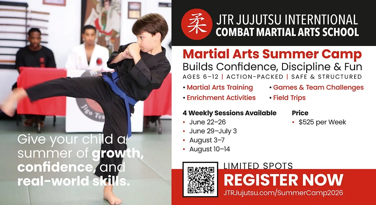
Oversized Postcards: A Tangible Connection
We opted for an oversized postcard format to give the artwork room to breathe. Unlike standard mailers, the larger scale allows for a "hero" image that commands attention immediately. The layout was structured to highlight the core benefits of the camp—focus, discipline, and fun—while keeping the essential logistics (dates, ages, and registration info) easy to find. By utilizing a clean, bold typographic hierarchy, we ensured the message was legible even for a busy parent skimming their mail.
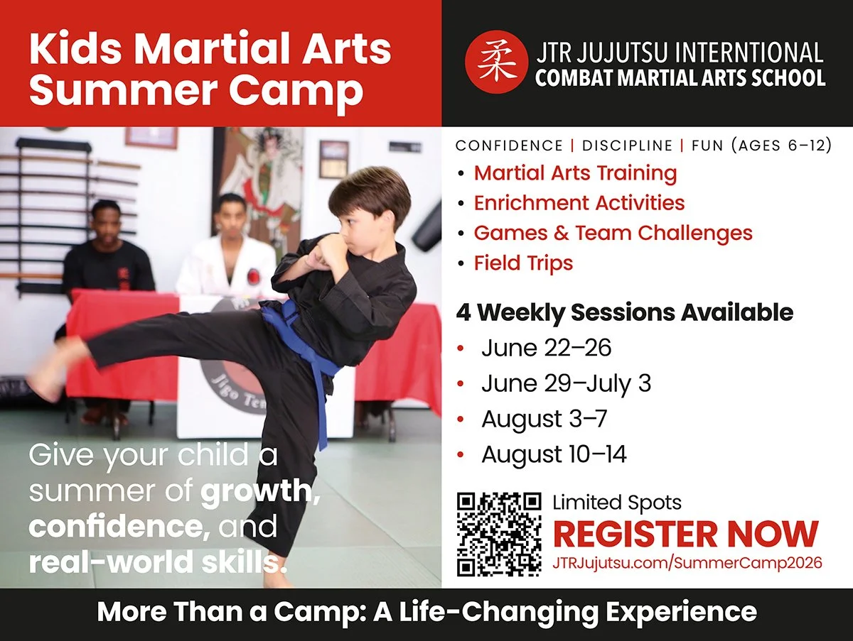
Yard Signs: Maximum Visibility
Designing for the outdoors presents a unique set of challenges. A yard sign has about three seconds to convey its message to a passing driver. For the JTR signs, we prioritized:
High Contrast: Using a bold color palette to ensure the sign stands out against green grass and varied neighborhood backgrounds.
Minimalist Messaging: Reducing the text to the absolute essentials—the camp name and a clear call to action.
Brand Recognition: Incorporating the JTR logo prominently with a clean use of red and black grid so that the community immediately recognizes the source of the program.
A Unified Summer Identity
Whether it was a 24-inch yard sign or a glossy postcard, the "look and feel" remained consistent. This cohesive branding builds trust and makes the camp feel like a premier event. It was a pleasure to work on these pieces, knowing they will help local kids find their way to the mat this summer.
Enrollment is Open!
If you have a young martial artist ready to spend their summer building confidence and skills, you can find all the details and registration forms at jtrjujutsu.com.
“Working with Alston Taggart and her team at Studio Red has been an outstanding experience. She recently created print designs for our martial arts summer camp, and the entire process was seamless and smooth from start to finish. Alston is a highly professional, creative, and easy to work with. She took time to understand my vision and then delivered designs that are clean, engaging, and aligned with our brand. I feel her work struck the right balance between quality and affordability, which is invaluable for small business owner like myself. Beyond her talent, Alston is simply a pleasure to collaborate with. I’m very grateful for her support.”
—Master Don, JTR Jujutsu International