Your challenges…
our thoughts.
Take a look at our blog where you’ll get a behind the scenes look at the how our design process works. We share examples of our sketches and finished products, as well as some fun stories about us.
Stay connected!
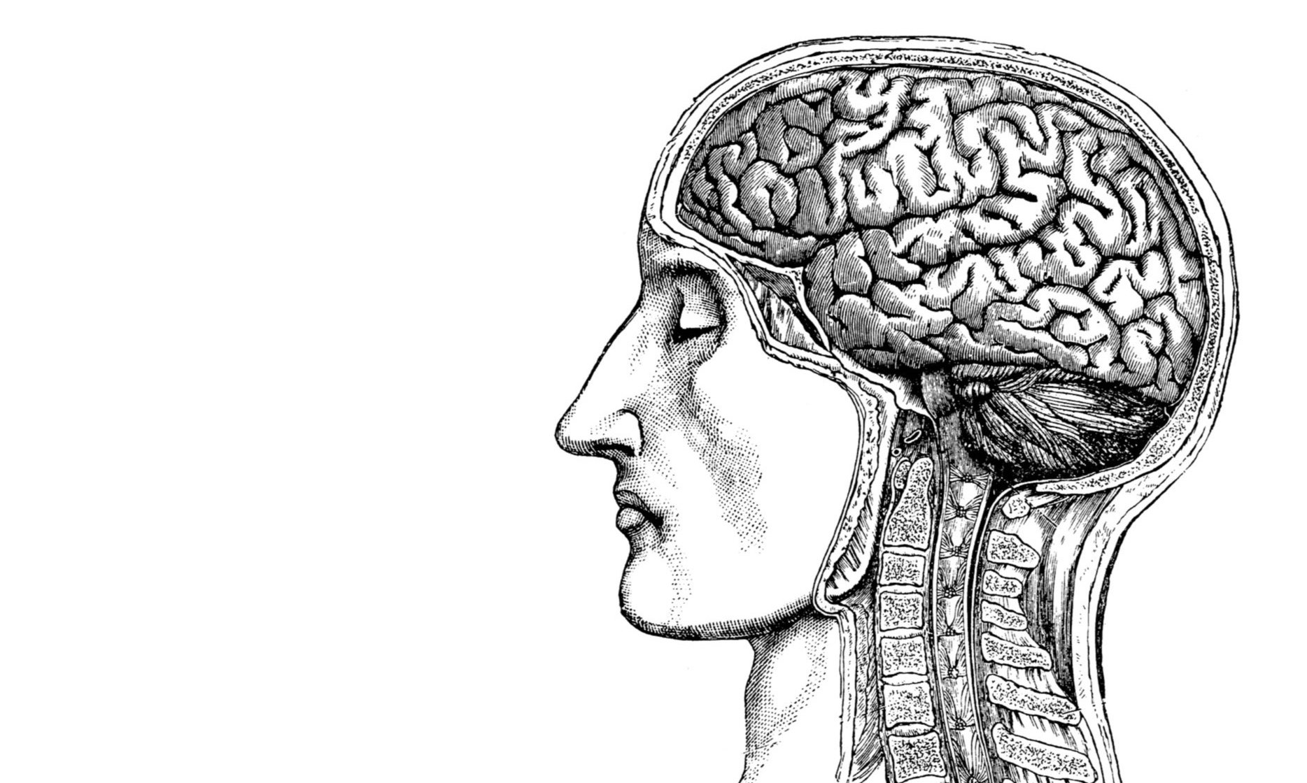
Instant Understanding
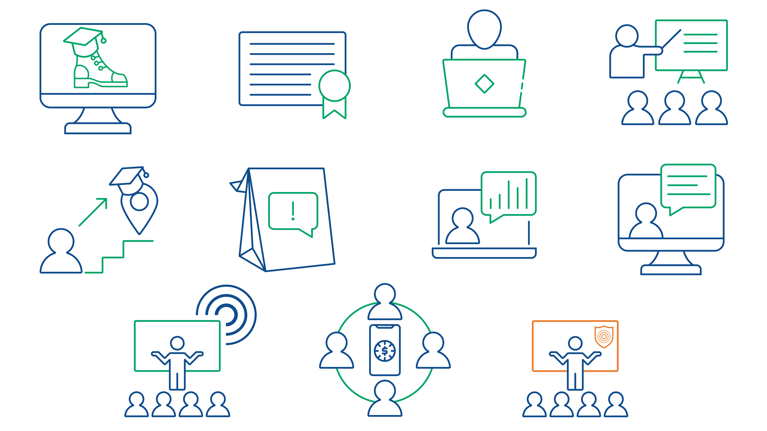
They say a picture is worth a thousand words. In the fast-paced world of digital payments, where complex jargon like ACH, RTP®, and Risk Compliance can quickly overwhelm, a well-designed icon is worth even more: it’s worth instant understanding.
We recently had the pleasure of partnering with Wespay to refresh their visual toolkit with a suite of custom line-art icons. The goal? To take their diverse range of member offerings—from education and advocacy to technical payment support—and make them immediately accessible through high-end design.
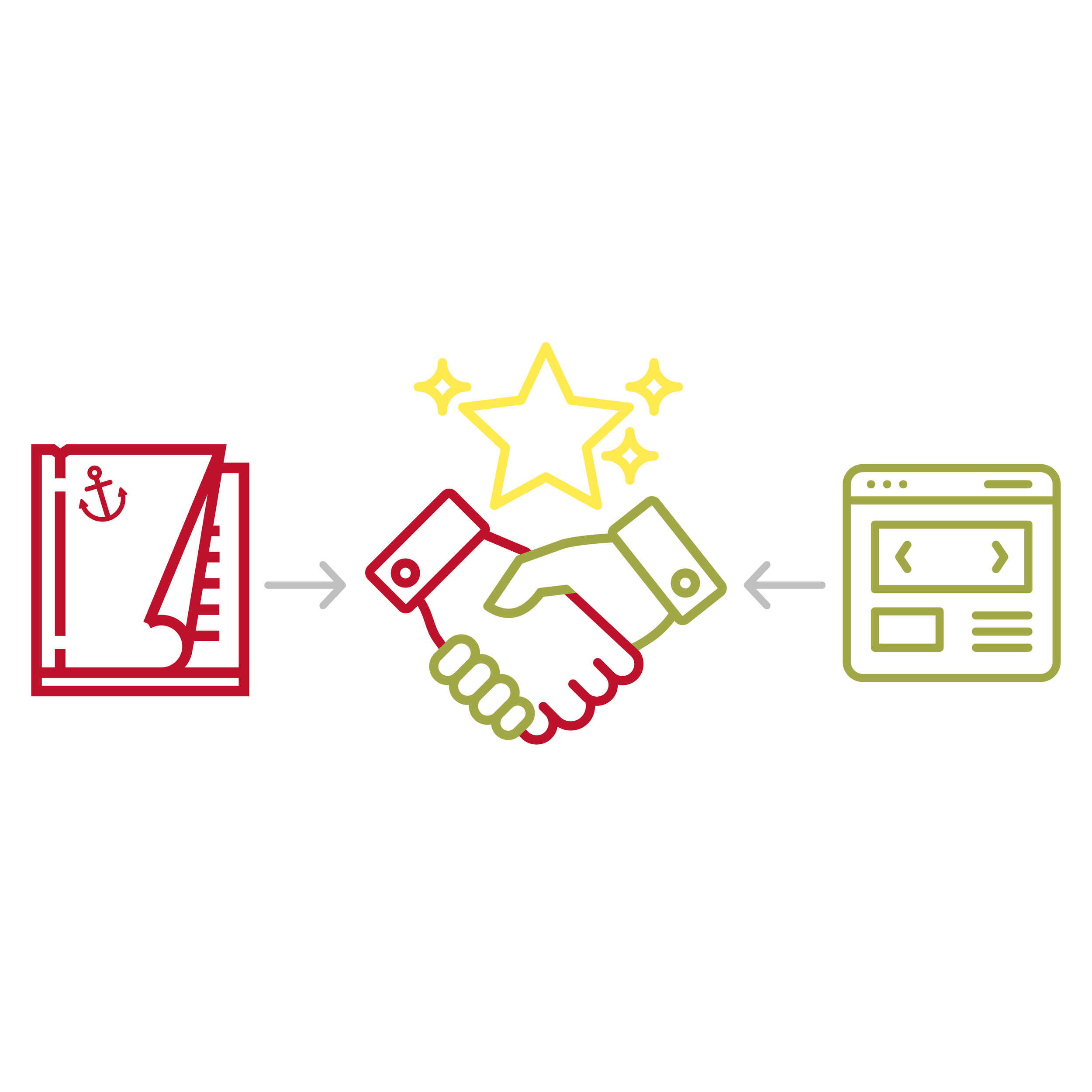
Print: An Anchor of Credibility
At the recent American Society of Association Executives (ASAE) meeting—the "association for associations"—the directive for 2026 was clear: to thrive in a shifting landscape, organizations must rebuild around digital experiences. But as we move toward a digital-first sponsor strategy, a crucial truth remains: Print is the anchor of credibility.
At Studio Red Design, we help associations navigate this "Media Harmony." It’s not about choosing between digital and print; it’s about using each to build a seamless, high-trust environment for members and sponsors alike. We help associations bridge their aesthetics consistently across their print needs (as conference materials, ads, posters, signage…) to their more daily digital presence.
Design with Compassion
It’s an honor to work with the International Campaign for Tibet (ICT) and help with the graphics surrounding His Holiness’s birthday. We began by grounding the concepts with classic creative techniques, sketching various layouts with pencil and refining initial concepts in InDesign. This deliberate, iterative approach ensured the final look was deeply considered and perfectly embodied the campaign's spirit of hope and resilience. Once the aesthetic was decided—one that was both visually arresting and universally accessible—the challenge shifted from creation to global distribution. By translating the finalized design assets from our professional software into a versatile, user-friendly platform like Canva, we achieved a crucial goal: client empowerment.